
大家好,我是 Just,这里是「设计师工作日常」,今天分享的是一个牛顿摆物理效果动效,可以用在 loading 加载动画的需求场景中,提高用户体验感。
最新文章通过公众号「设计师工作日常」发布。
(目录)
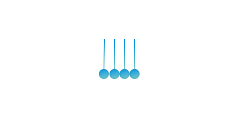
整体效果
知识点: ①
transform属性中transform-origin变形中参考点(基点) ② 伪元素:before、:after③animation动画 ④flex布局
思路: 绘制4个牛顿摆的小球以及绳子,然后让第一个小球和最后一个小球进行动画摆动。
一个牛顿摆物理效果动效,可以用在 loading 加载动画的需求场景中,提高用户体验感。
核心代码部分,简要说明了写法思路;完整代码在最后,可直接复制到本地运行。
核心代码
html 代码
<div class="niudunbai59">
  <div class="niudunbai-dot-59"></div>
  <div class="niudunbai-dot-59"></div>
  <div class="niudunbai-dot-59"></div>
  <div class="niudunbai-dot-59"></div>
</div>
.niudunbai59标签作为整个牛顿摆的主体块,然后下面 4 个子元素标签.niudunbai-dot-59作为 4 个小球的主体。
css 部分代码
.niudunbai59{
  width: 80px;
  height: 80px;
  position: relative;
  display: flex;
  justify-content: center;
  align-items: center;
}
.niudunbai-dot-59{
  width: 20px;
  height: 100%;
  display: flex;
  justify-content: center;
  align-items: flex-end;
  transform-origin: center top;
}
.niudunbai-dot-59:before{
  content: '';
  width: 20px;
  height: 20px;
  position: relative;
  border-radius: 50%;
  background-color: #0093E9;
  background-image: linear-gradient(160deg, #0093E9 0%, #80D0C7 100%);
  box-shadow: inset 0 0 4px rgba(0,0,0,0.2);
}
.niudunbai-dot-59:after{
  content: '';
  width: 2px;
  height: 60px;
  position: absolute;
  top: 0;
  background-color: #0093E9;
  background-image: linear-gradient(160deg, #0093E9 0%, #80D0C7 100%);
}
.niudunbai-dot-59:first-child{
  animation: eff59 1.4s infinite;
}
.niudunbai-dot-59:last-child{
  animation: eff592 1.4s infinite;
}
@keyframes eff59{
  0% {
    transform: rotate(0deg);
    animation-timing-function: ease-out;
  }

  25% {
    transform: rotate(70deg);
    animation-timing-function: ease-in;
  }

  50% {
    transform: rotate(0deg);
    animation-timing-function: linear;
  }
}
@keyframes eff592{
  0% {
    transform: rotate(0deg);
    animation-timing-function: linear;
  }

  50% {
    transform: rotate(0deg);
    animation-timing-function: ease-out;
  }

  75% {
    transform: rotate(-70deg);
    animation-timing-function: ease-in;
  }
}
1、定义整体牛顿摆
.niudunbai59的大小等样式,设置flex布局,定义子元素平行垂直居中。
2、定义悬挂的小球
.niudunbai-dot-59整体大小样式,设置变形的参考点transform-origin: center top;;设置flex布局,定义子元素平行垂直居中 。
3、基于
.niudunbai-dot-59创建伪元素:before和:after,分别作为小球以及绳子,分别定义其样式,这里给小球以及绳子增加了渐变背景以及内阴影效果。
4、给第一个以及最后一个悬挂的小球,分别增加一个
animation动画属性,创建动画名称分别为eff59和eff592,并设置infinite无限循环播放。
5、分别给动画
eff59和eff592设置关键帧,让其变化角度。
注意: 这里的关键帧的角度变化时要叉开,一个小球摆动起来时,另一个小球要回到原位。还有就是当小球摆动到最高点时,要有一点滞空的视觉效果,所以这里还分别设置了 animation-timing-function 动画速度曲线的属性参数。
完整代码如下
html 页面
<!DOCTYPE html>
<html lang="zh">
  <head>
    <meta charset="utf-8">
    <link rel="stylesheet" href="style.css">
    <title>牛顿摆</title>
  </head>
  <body>
    <div class="app">
      <div class="niudunbai59">
        <div class="niudunbai-dot-59"></div>
        <div class="niudunbai-dot-59"></div>
        <div class="niudunbai-dot-59"></div>
        <div class="niudunbai-dot-59"></div>
      </div>
    </div>
  </body>
</html>
css 样式
/** style.css **/
.app{
  width: 100%;
  height: 100vh;
  background-color: #ffffff;
  position: relative;
  display: flex;
  justify-content: center;
  align-items: center;
}
.niudunbai59{
  width: 80px;
  height: 80px;
  position: relative;
  display: flex;
  justify-content: center;
  align-items: center;
}
.niudunbai-dot-59{
  width: 20px;
  height: 100%;
  display: flex;
  justify-content: center;
  align-items: flex-end;
  transform-origin: center top;
}
.niudunbai-dot-59:before{
  content: '';
  width: 20px;
  height: 20px;
  position: relative;
  border-radius: 50%;
  background-color: #0093E9;
  background-image: linear-gradient(160deg, #0093E9 0%, #80D0C7 100%);
  box-shadow: inset 0 0 4px rgba(0,0,0,0.2);
}
.niudunbai-dot-59:after{
  content: '';
  width: 2px;
  height: 60px;
  position: absolute;
  top: 0;
  background-color: #0093E9;
  background-image: linear-gradient(160deg, #0093E9 0%, #80D0C7 100%);
}
.niudunbai-dot-59:first-child{
  animation: eff59 1.4s infinite;
}
.niudunbai-dot-59:last-child{
  animation: eff592 1.4s infinite;
}
@keyframes eff59{
  0% {
    transform: rotate(0deg);
    animation-timing-function: ease-out;
  }

  25% {
    transform: rotate(70deg);
    animation-timing-function: ease-in;
  }

  50% {
    transform: rotate(0deg);
    animation-timing-function: linear;
  }
}
@keyframes eff592{
  0% {
    transform: rotate(0deg);
    animation-timing-function: linear;
  }

  50% {
    transform: rotate(0deg);
    animation-timing-function: ease-out;
  }

  75% {
    transform: rotate(-70deg);
    animation-timing-function: ease-in;
  }
}
页面渲染效果
以上就是所有代码,以及简单的思路,希望对你有一些帮助或者启发。
CSS 是一种很酷很有趣的计算机语言,在这里跟大家分享一些 CSS 实例 Demo,为学习者获取灵感和思路提供一点帮助,希望你们喜欢。
我是 Just,这里是「设计师工作日常」,求点赞求关注!


