
大家好,我是 Just,这里是「设计师工作日常」,今天分享的是利用动画属性来模拟文字隐身消失的效果。
最新文章通过公众号「设计师工作日常」发布。
(目录)
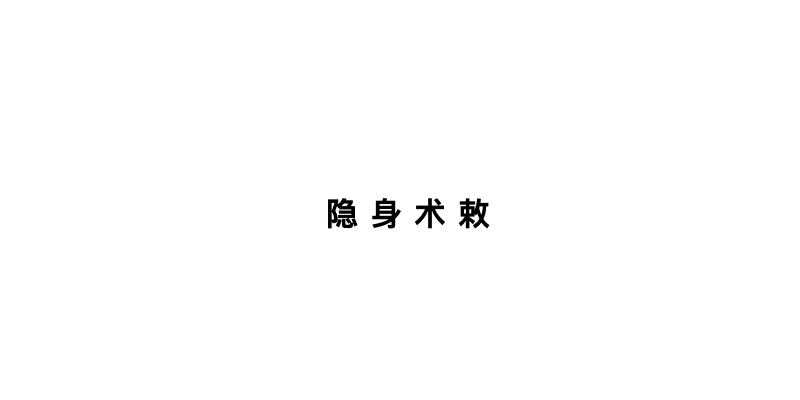
整体效果
知识点: ① 关于
transform多属性的运用 ②:nth-of-type(n)伪选择器的使用 ③animation的使用 ④filter中模糊属性blur()的使用
思路:给每个文字加上模糊、变形、位移等属性,并且设置动画参数来模拟文字渐渐隐身消失的视觉效果。
核心代码部分,简要说明了写法思路;完整代码在最后,可直接复制到本地运行。
核心代码
html 代码
<div class="text55">
  <span class="textspan55">隐</span>
  <span class="textspan55">身</span>
  <span class="textspan55">术</span>
  <span class="textspan55">敕</span>
</div>
每个文字都作为一个独立的标签。
css 部分代码
.text55{
  position: relative;
  display: flex;
  justify-content: center;
  align-items: center;
}
.textspan55{
  font-size: 16px;
  font-weight: 800;
  color: rgba(0,0,0,1);
  letter-spacing: 6px;
  animation: textspaneff55 3s linear infinite;
}
.textspan55:nth-of-type(1){
  animation-delay: 1.8s;
}
.textspan55:nth-of-type(2){
  animation-delay: 2.2s;
}
.textspan55:nth-of-type(3){
  animation-delay: 2.6s;
}
.textspan55:nth-of-type(4){
  animation-delay: 3s;
}
@keyframes textspaneff55{
  50%{
    text-shadow: 0 0 0 rgba(0,0,0,0);
    filter: blur(0);
    transform: translate(0, 0) rotate(0deg) skew(0deg) scale(1);
    color: rgba(0,0,0,1);
    opacity: 1;
  }
  80%{
    text-shadow: 0 0 8px rgba(0,0,0,1);
    filter: blur(10px);
  }
  100%{
    text-shadow: 0 0 0 rgba(0,0,0,0);
    filter: blur(20px);
    transform: translate(100px, -100px) rotate(-45deg) skew(60deg) scale(2);
    color: rgba(0,0,0,0);
    opacity: 0;
  }
}
1、给所有的文字标签
textspan55写出公共样式,并且加上animation动画
2、定义
animation动画参数,注意定义关键帧时,从 50% 开始做动画效果,前面的 50% 作为动画启动前的延迟;定义动画参数时,文字对象从模糊值、透明度、位移、旋转、变形和放大等方面进行调试,尝试不同的值来变化,调试出你喜欢的效果。
3、最后利用
:nth-of-type(n)让每个文字元素延迟动画,文字元素依次进行动画效果,形成文字漂移隐身消失的视觉效果
完整代码如下
html 页面
<!DOCTYPE html>
<html lang="zh">
  <head>
    <meta charset="utf-8">
    <link rel="stylesheet" href="style.css">
    <title>文字隐身术</title>
  </head>
  <body>
    <div class="app">
      <div class="text55">
        <span class="textspan55">隐</span>
        <span class="textspan55">身</span>
        <span class="textspan55">术</span>
        <span class="textspan55">敕</span>
      </div>
    </div>
  </body>
</html>
css 样式
/** style.css **/
.app{
  width: 100%;
  height: 100vh;
  background-color: #ffffff;
  position: relative;
  display: flex;
  justify-content: center;
  align-items: center;
}
.text55{
  position: relative;
  display: flex;
  justify-content: center;
  align-items: center;
}
.textspan55{
  font-size: 16px;
  font-weight: 800;
  color: rgba(0,0,0,1);
  letter-spacing: 6px;
  animation: textspaneff55 3s linear infinite;
}
.textspan55:nth-of-type(1){
  animation-delay: 1.8s;
}
.textspan55:nth-of-type(2){
  animation-delay: 2.2s;
}
.textspan55:nth-of-type(3){
  animation-delay: 2.6s;
}
.textspan55:nth-of-type(4){
  animation-delay: 3s;
}
@keyframes textspaneff55{
  50%{
    text-shadow: 0 0 0 rgba(0,0,0,0);
    filter: blur(0);
    transform: translate(0, 0) rotate(0deg) skew(0deg) scale(1);
    color: rgba(0,0,0,1);
    opacity: 1;
  }
  80%{
    text-shadow: 0 0 8px rgba(0,0,0,1);
    filter: blur(10px);
  }
  100%{
    text-shadow: 0 0 0 rgba(0,0,0,0);
    filter: blur(20px);
    transform: translate(100px, -100px) rotate(-45deg) skew(60deg) scale(2);
    color: rgba(0,0,0,0);
    opacity: 0;
  }
}
页面渲染效果
以上就是所有代码,以及简单的思路,希望对你有一些帮助或者启发。
我是 Just,这里是「设计师工作日常」,求点赞求关注!


