
大家好,我是 Just,这里是「设计师工作日常」,今天分享的是使用css实现一个好看的聚光灯效果。
《有趣的css》系列最新实例通过公众号「设计师工作日常」发布。
(目录)
整体效果
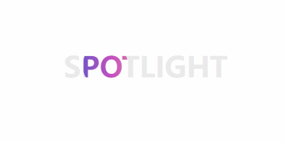
使用
-webkit-background-clip和clip-path,并配合animation属性,实现一个好看聚光灯效果。
可适用于页面加载或展示页面大标题内容。
核心代码部分,简要说明了写法思路;完整代码在最后,可直接复制到本地运行。
核心代码
html 代码
<div class="spotlight18" data-cont="spotlight">spotlight</div>
主体部分一个
div标签。
css 部分代码
.spotlight18{
  color: #eaeaea;
  font-size: 40px;
  font-weight: 900;
  text-transform: uppercase;
  position: relative;
}
.spotlight18:before{
  width: inherit;
  height: inherit;
  content: attr(data-cont);
  clip-path: ellipse(32px 32px at 0 50%);
  color: transparent;
  background-image: linear-gradient(90deg, #4158D0 0%, #C850C0 30%, #FFCC70 66%, #56e28d 100%);
  -webkit-background-clip: text;
  position: absolute;
  top: 0;
  left: 0;
  animation: spotlight18 8s linear infinite;
}
@keyframes spotlight18{
  0%{
    clip-path: ellipse(32px 32px at 0 50%);
  }
  50%{
    clip-path: ellipse(32px 32px at 100% 50%);
  }
  100%{
    clip-path: ellipse(32px 32px at 0 50%);
  }
}
用
background-image的linear-gradient拉出渐变背景,让文字颜色透明color: transparent,然后配合-webkit-background-clip: text给文字实现渐变效果,最后加上动画属性animation并设置clip-path参数就可以啦。
注意:这里使用的是 -webkit-background-clip ,而不是 background-clip 。
完整代码如下
html 页面
<!DOCTYPE html>
<html lang="zh">
  <head>
    <meta charset="utf-8">
    <link rel="stylesheet" href="style.css">
    <title>聚光灯效果</title>
  </head>
  <body>
    <div class="app">
      <div class="spotlight18" data-cont="spotlight">spotlight</div>
    </div>
  </body>
</html>
css 样式
/** style.css **/
.app{
  width: 100%;
  height: 100vh;
  background-color: #ffffff;
  position: relative;
  display: flex;
  justify-content: center;
  align-items: center;
}
.spotlight18{
  color: #eaeaea;
  font-size: 40px;
  font-weight: 900;
  text-transform: uppercase;
  position: relative;
}
.spotlight18:before{
  width: inherit;
  height: inherit;
  content: attr(data-cont);
  color: transparent;
  background-image: linear-gradient(90deg, #4158D0 0%, #C850C0 30%, #FFCC70 66%, #56e28d 100%);
  -webkit-background-clip: text;
  position: absolute;
  top: 0;
  left: 0;
  animation: spotlight18 8s linear infinite;
}
@keyframes spotlight18{
  0%{
    clip-path: ellipse(32px 32px at 0 50%);
  }
  50%{
    clip-path: ellipse(32px 32px at 100% 50%);
  }
  100%{
    clip-path: ellipse(32px 32px at 0 50%);
  }
}
页面渲染效果
以上就是所有代码,以及简单的思路,希望对你有一些帮助或者启发。
CSS 是一种很酷很有趣的计算机语言,在这里跟大家分享一些 CSS 实例 Demo,为学习者获取灵感和思路提供一点帮助,希望你们喜欢。
我是 Just,这里是「设计师工作日常」,求点赞求关注!


