
大家好,我是 Just,这里是「设计师工作日常」,今天分享的是使用 box-shadow 属性模拟绘制 windows98 系统风格按钮。
最新文章通过公众号「设计师工作日常」发布。
(目录)
整体效果
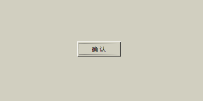
使用
box-shadow属性模拟 windows98 系统风格按钮及点击效果。
一个 windows98 系统复古按钮风格的按钮。
核心代码部分,简要说明了写法思路;完整代码在最后,可直接复制到本地运行。
核心代码
html 代码
<button class="btn36">确 认</button>
主体
button标签
css 部分代码
.btn36{
  width: 86px;
  height: 30px;
  background-color: #d1cfc0;
  font-size: 12px;
  color: #000000;
  outline: 1px dotted #333333;
  outline-offset: -4px;  /* 轮廓线偏移 */
  border: none;
  box-shadow: inset 1px 1px 1px #fff, inset -1px -1px 1px #333333;  /* 按钮默认内阴影样式 */
  transition: 0.1s linear;
}
.btn36:active{
  box-shadow: inset 1px 1px 1px #333333, inset -1px -1px 1px #fff;  /* 按钮点击时内阴影样式 */
  transform: scale(0.98);
}
:active获取鼠标点击状态,默认和点击时切换box-shadow阴影属性样式。
完整代码如下
html 页面
<!DOCTYPE html>
<html lang="zh">
  <head>
    <meta charset="utf-8">
    <link rel="stylesheet" href="style.css">
    <title>wins98 复古按钮</title>
  </head>
  <body>
    <div class="app">
      <button class="btn36">确 认</button>
    </div>
  </body>
</html>
css 样式
/** style.css **/
.app{
  width: 100%;
  height: 100vh;
  background-color: #d1cfc0;
  position: relative;
  display: flex;
  justify-content: center;
  align-items: center;
}
.btn36{
  width: 86px;
  height: 30px;
  background-color: #d1cfc0;
  font-size: 12px;
  color: #000000;
  outline: 1px dotted #333333;
  outline-offset: -4px;
  border: none;
  box-shadow: inset 1px 1px 1px #fff, inset -1px -1px 1px #333333;
  transition: 0.1s linear;
}
.btn36:active{
  box-shadow: inset 1px 1px 1px #333333, inset -1px -1px 1px #fff;
  transform: scale(0.98);
}
页面渲染效果
以上就是所有代码,以及简单的思路,希望对你有一些帮助或者启发。
我是 Just,这里是「设计师工作日常」,求点赞求关注!


