
大家好,我是 Just,这里是「设计师工作日常」,今天分享的是用css模拟实现一个好看的开关按钮动效。
最新文章通过公众号「设计师工作日常」发布。
(目录)
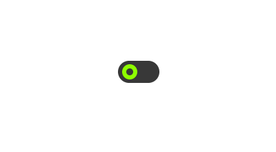
整体效果
用
label和input标签模拟开关按钮,然后用:checked属性选择器来判断开关状态,再加入css3 的过渡效果,实现开关的动效。
适用于移动端开发场景,一个好看的开关按钮动效。
核心代码部分,简要说明了写法思路;完整代码在最后,可直接复制到本地运行。
核心代码
html 代码
<label class="label33">
  <input class="inp33" type="checkbox">
  <span class="check-span33"></span>
</label>
用
label和input标签绘制开关按钮。
css 部分代码
.label33{
  width: 60px;
  height: 32px;
  position: relative;
  cursor: pointer;
}
.inp33{
  display: none;
}
.check-span33{
  width: 100%;
  height: 100%;
  display: block;
  background-color: #383838;
  border-radius: 16px;
  transition: 0.3s linear;
}
.check-span33:after{
  content: '';
  width: 22px;
  height: 22px;
  border: 6px solid greenyellow;
  border-radius: 11px;
  position: absolute;
  top: 5px;
  left: 6px;
  box-sizing: border-box;
  transition: 0.3s ease-in-out;
}
.inp33:checked + .check-span33{
  background-color: green;
}
.inp33:checked + .check-span33:after{
  transform: translateX(26px);
  border: 6px solid white;
}
通过
:checked属性选择器获取开关的状态,然后分别切换不同的样式,然后通过transition实现开关时的过渡效果,给人视觉上开关的效果。
完整代码如下
html 页面
<!DOCTYPE html>
<html lang="zh">
  <head>
    <meta charset="utf-8">
    <link rel="stylesheet" href="style.css">
    <title>好看的开关按钮</title>
  </head>
  <body>
    <div class="app">
      <label class="label33">
        <input class="inp33" type="checkbox">
        <span class="check-span33"></span>
      </label>
    </div>
  </body>
</html>
css 样式
/** style.css **/
.app{
  width: 100%;
  height: 100vh;
  background-color: #ffffff;
  position: relative;
  display: flex;
  justify-content: center;
  align-items: center;
}
.label33{
  width: 60px;
  height: 32px;
  position: relative;
  cursor: pointer;
}
.inp33{
  display: none;
}
.check-span33{
  width: 100%;
  height: 100%;
  display: block;
  background-color: #383838;
  border-radius: 16px;
  transition: 0.3s linear;
}
.check-span33:after{
  content: '';
  width: 22px;
  height: 22px;
  border: 6px solid greenyellow;
  border-radius: 11px;
  position: absolute;
  top: 5px;
  left: 6px;
  box-sizing: border-box;
  transition: 0.3s ease-in-out;
}
.inp33:checked + .check-span33{
  background-color: green;
}
.inp33:checked + .check-span33:after{
  transform: translateX(26px);
  border: 6px solid white;
}
页面渲染效果
以上就是所有代码,以及简单的思路,希望对你有一些帮助或者启发。
我是 Just,这里是「设计师工作日常」,求点赞求关注!


