
大家好,我是 Just,这里是「设计师工作日常」,今天分享的是使用纯 css 打造一个跑马灯效果的按钮。
最新文章通过公众号「设计师工作日常」发布。
(目录)
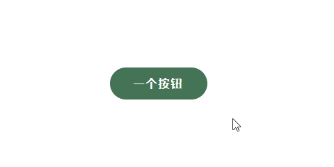
整体效果
知识点: ①
:hover的灵活使用 ②text-shadow属性的使用 ③animation动画的使用
思路: 按钮上分别写出文字内容以及其跑马灯的文字内容,然后利用
:hover来显示隐藏文字内容和跑马灯动画的切换。
核心代码部分,简要说明了写法思路;完整代码在最后,可直接复制到本地运行。
核心代码
html 代码
<a rel="nofollow" href="javascript:;" class="abtn57">
  <div class="btn57">一个按钮</div>
  <span class="bg57">一个按钮</span>
</a>
a标签作为按钮主体,然后.abtn57作为按钮上的文字内容,.bg57作为跑马灯主体内容。
css 部分代码
.abtn57{
  width: 140px;
  height: 46px;
  list-style: none;
  text-decoration: none;
  display: flex;
  justify-content: center;
  align-items: center;
  background: #457356;
  position: relative;
  cursor: pointer;
  border-radius: 23px;
  overflow: hidden;
}
.btn57,.bg57{
  font-size: 16px;
  font-weight: bold;
  letter-spacing: 2px;
  color: #ffffff;
}
.bg57{
  position: absolute;
  text-shadow: 90px 0 #fff, -90px 0 #fff,-180px 0 #fff;
  animation: effx57 1.2s linear infinite;
  display: none;
}
@keyframes effx57{
  to{
    transform: translateX(90px);
  }
}
.abtn57:hover .bg57{
  display: block;
}
.abtn57:hover .btn57{
  display: none;
}
1、先定义按钮
.abtn57的大小尺寸等样式,这里要加上overflow: hidden,防止内容溢出。
2、然后定义
.btn57和.bg57的共同样式;然后再利用text-shadow属性,给.bg57投影出三个投影,分别定义其 x 轴的值为90px、-90px、-180px,然后给.bg57加上动画属性,定义动画参数,让 3 个投影以及其.bg57的原文字元素沿 x 轴从左往右移动,形成跑马灯效果。
3、根据伪元素
:hover状态,让.btn57和.bg57切换其隐藏显示状态。
完整代码如下
html 页面
<!DOCTYPE html>
<html lang="zh">
  <head>
    <meta charset="utf-8">
    <link rel="stylesheet" href="style.css">
    <title>文字跑马灯按钮</title>
  </head>
  <body>
    <div class="app">
      <a rel="nofollow" href="javascript:;" class="abtn57">
        <div class="btn57">一个按钮</div>
        <span class="bg57">一个按钮</span>
      </a>
    </div>
  </body>
</html>
css 样式
/** style.css **/
.app{
  width: 100%;
  height: 100vh;
  background-color: #ffffff;
  position: relative;
  display: flex;
  justify-content: center;
  align-items: center;
}
.abtn57{
  width: 140px;
  height: 46px;
  list-style: none;
  text-decoration: none;
  display: flex;
  justify-content: center;
  align-items: center;
  background: #457356;
  position: relative;
  cursor: pointer;
  border-radius: 23px;
  overflow: hidden;
}
.btn57,.bg57{
  font-size: 16px;
  font-weight: bold;
  letter-spacing: 2px;
  color: #ffffff;
}
.bg57{
  position: absolute;
  text-shadow: 90px 0 #fff, -90px 0 #fff,-180px 0 #fff;
  animation: effx57 1.2s linear infinite;
  display: none;
}
@keyframes effx57{
  to{
    transform: translateX(90px);
  }
}
.abtn57:hover .bg57{
  display: block;
}
.abtn57:hover .btn57{
  display: none;
}
页面渲染效果
以上就是所有代码,以及简单的思路,希望对你有一些帮助或者启发。
我是 Just,这里是「设计师工作日常」,求点赞求关注!


