
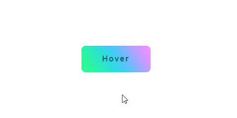
大家好,我是 Just,这里是「设计师工作日常」,今天分享的是一个背景不停变幻的按钮,适用在一些比较年轻、青春风格的网站app中,也可在比较多巴胺风、风格强烈的专题页中使用。
最新文章通过公众号「设计师工作日常」发布。
(目录)
整体效果
知识点: 1️⃣
background-image属性 2️⃣ 伪元素::before和::after3️⃣content: attr(...)用法 4️⃣transform变形属性和transition过渡属性 5️⃣:hover选择器和:active选择器 6️⃣animation动画
思路:按钮使用渐变背景,然后让渐变背景旋转,再加一点模糊效果。
适用在一些比较年轻、青春风格的网站app中,也可在比较多巴胺风、风格强烈的专题页中使用。
核心代码部分,简要说明了写法思路;完整代码在最后,可直接复制到本地运行。
核心代码
html 代码
<button class="btn63" data-text="Hover"></button>
button按钮主体标签,绑定data-text值。
css 部分代码
.btn63{
  width: 140px;
  height: 54px;
  border: none;
  border-radius: 9px;
  background-color: transparent;  /* 背景透明 */
  position: relative;
  display: flex;
  justify-content: center;
  align-items: center;
  overflow: hidden;  /* 限制溢出的元素 */
  cursor: pointer;
}
.btn63::before{
  content: '';
  width: 200px;
  height: 200px;
  position: absolute;
  background-color: #FA8BFF;
  background-image: linear-gradient(90deg, #FA8BFF 20%, #2BD2FF 50%, #2BFF88 80%);
  filter: blur(16px);
  animation: eff63 4s linear infinite;
}
.btn63::after{
  content: attr(data-text);
  font-size: 16px;
  font-weight: bold;
  color: rgba(0,0,0,0.6);
  letter-spacing: 2px;
  position: absolute;
  transition: all .3s linear;
}
@keyframes eff63{
  from{
    transform: rotate(0deg);
  }
  to{
    transform: rotate(360deg);
  }
}
.btn63:hover::before{
  width: 140px;
  height: 140px;
  filter: blur(24px);
}
.btn63:hover::after{
  color: rgba(0,0,0,0.9);
  text-shadow: 0 1px 0 rgba(255,255,255,0.4);
}
.btn63:active {
  transform: scale(0.9) translateY(2px);
}
1、定义按钮主体
button的基本样式外观,背景为background-color: transparent;透明,overflow: hidden;限制溢出的元素。
2、基于主体
button分别创建伪元素::before和::after,伪元素::before作为按钮背景,通过background-image将背景色设置为渐变背景色,filter: blur(...)设置模糊度,最后设置animation动画,让伪元素::before循环旋转360°。
3、伪元素
::after通过content: attr(data-text)获取button绑定的data-text值,作为按钮上面的文字内容。
4、最后根据
:hover和:active选择器,来改变伪元素::before、伪元素::after以及按钮被点击时的样式变化。
注意: 当伪元素 ::before 和 ::after 基于某个主体创建后,如果根据 :hover 等选择器在判断主体时,来改变伪元素的样式变化,请注意写法为 主体标签:hover:before ,例如此文中的 .btn63:hover::after。
完整代码如下
html 页面
<!DOCTYPE html>
<html lang="zh">
  <head>
    <meta charset="utf-8">
    <link rel="stylesheet" href="style.css">
    <title>变幻的按钮</title>
  </head>
  <body>
    <div class="app">
      <button class="btn63" data-text="Hover"></button>
    </div>
  </body>
</html>
css 样式
/** style.css **/
.app{
  width: 100%;
  height: 100vh;
  background-color: #ffffff;
  position: relative;
  display: flex;
  justify-content: center;
  align-items: center;
}
.btn63{
  width: 140px;
  height: 54px;
  border: none;
  border-radius: 9px;
  background-color: transparent;
  position: relative;
  display: flex;
  justify-content: center;
  align-items: center;
  overflow: hidden;
  cursor: pointer;
}
.btn63::before{
  content: '';
  width: 200px;
  height: 200px;
  position: absolute;
  background-color: #FA8BFF;
  background-image: linear-gradient(90deg, #FA8BFF 20%, #2BD2FF 50%, #2BFF88 80%);
  filter: blur(16px);
  animation: eff63 4s linear infinite;
}
.btn63::after{
  content: attr(data-text);
  font-size: 16px;
  font-weight: bold;
  color: rgba(0,0,0,0.6);
  letter-spacing: 2px;
  position: absolute;
  transition: all .3s linear;
}
@keyframes eff63{
  from{
    transform: rotate(0deg);
  }
  to{
    transform: rotate(360deg);
  }
}
.btn63:hover::before{
  width: 140px;
  height: 140px;
  filter: blur(24px);
}
.btn63:hover::after{
  color: rgba(0,0,0,0.9);
  text-shadow: 0 1px 0 rgba(255,255,255,0.4);
}
.btn63:active {
  transform: scale(0.9) translateY(2px);
}
页面渲染效果
以上就是所有代码,以及简单的思路,希望对你有一些帮助或者启发。
我是 Just,这里是「设计师工作日常」,求点赞求关注!


