
Modal是模态视图,它的作用是可以用来覆盖 React Native中根视图的原生视图,Modal模态视图是一种覆盖包围当前内容视图的一个简单方法。
注意:如果你需要如何在您的应用程序的其余部分呈现模态的更多控制,那么可以考虑使用顶级导航(top-level Navigator)。
Modal 属性
照例,我想大家都知道我的习惯了,毕竟官网也是这个顺序,那就是在用人之前,先要了解人,毕竟疑人不用,用人不疑嘛,要想相信一个人,首先得了解一个人嘛。来,看看 Modal 的相关属性。
animated bool 是否有动画效果,不过这个属性已经被抛弃了,取之代替的是:animationType
animationType (['none', 'slide', 'fade']) 这个animationType属性作用就是如何控制模态动画,有一下三个类型:
none 出现的时候不带动画效果
fade 带有淡入动画的效果
slide 从底部滑动出来的动画效果
onRequestClose Platform.OS === 'android' ? PropTypes.func.isRequired : PropTypes.func 这是一个 Android 平台需要的属性,它的作用是当这个模态视图取消或者关闭消失的时候回调这个函数
onShow function 当模态视图显示的时候调用此函数
transparent bool 布尔值,是否透明,true 将使得在一个透明背景的模式
visible bool 布尔值,是否可见
onOrientationChange func ios 当在显示模态的方向变化时回调此函数
supportedOrientations ios (['portrait', 'portrait-upside-down', 'landscape', 'landscape-left', 'landscape-right']))
实例演示
来,我们大家一起看看这个效果的实现,看完效果就更加直观的能够感受到这个组件的作用和功能了。动态效果图如下: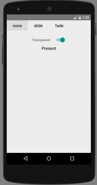
实例代码
import React, { Component } from 'react';
import {
AppRegistry,
StyleSheet,
Modal,
Picker,
Switch,
TouchableHighlight,
Text,
View
} from 'react-native';
class Button extends Component {
state = {
active: false,
};
_onHighlight = () => {
this.setState({active: true});
};
_onUnhighlight = () => {
this.setState({active: false});
};
render() {
var colorStyle = {
color: this.state.active ? '#fff' : '#000',
};
return (
<TouchableHighlight
onHideUnderlay={this._onUnhighlight}
onPress={this.props.onPress}
onShowUnderlay={this._onHighlight}
style={[styles.button, this.props.style]}
underlayColor="#a9d9d4">
<Text style={[styles.buttonText, colorStyle]}>{this.props.children}</Text>
</TouchableHighlight>
);
}
}
export default class ModalDemo extends Component {
state = {
animationType: 'none',
modalVisible: false,
transparent: false,
};
_setModalVisible = (visible) => {
this.setState({modalVisible: visible});
};
_setAnimationType = (type) => {
this.setState({animationType: type});
};
_toggleTransparent = () => {
this.setState({transparent: !this.state.transparent});
};
render() {
var modalBackgroundStyle = {
backgroundColor: this.state.transparent ? 'rgba(0, 0, 0, 0.5)' : '#f5fcff',
};
var innerContainerTransparentStyle = this.state.transparent
? {backgroundColor: '#fff', padding: 20}
: null;
var activeButtonStyle = {
backgroundColor: '#ddd'
};
return (
<View>
<Modal
animationType={this.state.animationType}
transparent={this.state.transparent}
visible={this.state.modalVisible}
onRequestClose={() => this._setModalVisible(false)}
>
<View style={[styles.container, modalBackgroundStyle]}>
<View style={[styles.innerContainer, innerContainerTransparentStyle]}>
<Text>This modal was presented {this.state.animationType === 'none' ? 'without' : 'with'} animation.</Text>
<Button
onPress={this._setModalVisible.bind(this, false)}
style={styles.modalButton}>
Close
</Button>
</View>
</View>
</Modal>
<View style={styles.row}>
<Text style={styles.rowTitle}>Animation Type</Text>
<Button onPress={this._setAnimationType.bind(this, 'none')} style={this.state.animationType === 'none' ? activeButtonStyle : {}}>
none
</Button>
<Button onPress={this._setAnimationType.bind(this, 'slide')} style={this.state.animationType === 'slide' ? activeButtonStyle : {}}>
slide
</Button>
<Button onPress={this._setAnimationType.bind(this, 'fade')} style={this.state.animationType === 'fade' ? activeButtonStyle : {}}>
fade
</Button>
</View>
<View style={{marginTop:50,flexDirection: 'row',alignItems: 'center',justifyContent: 'center'}}>
<Text style={{color:'grey',fontWeight: 'bold',marginRight:20}}>Transparent</Text>
<Switch value={this.state.transparent} onValueChange={this._toggleTransparent} />
</View>
<Button onPress={this._setModalVisible.bind(this, true)}>
Present
</Button>
</View>
);
}
}
const styles = StyleSheet.create({
container: {
flex: 1,
justifyContent: 'center',
padding: 20,
},
innerContainer: {
borderRadius: 10,
alignItems: 'center',
},
row: {
alignItems: 'center',
flex: 1,
flexDirection: 'row',
marginBottom: 20,
},
rowTitle: {
flex: 1,
fontWeight: 'bold',
},
button: {
borderRadius: 5,
flex: 1,
height: 44,
alignSelf: 'stretch',
justifyContent: 'center',
overflow: 'hidden',
},
buttonText: {
fontSize: 18,
margin: 5,
textAlign: 'center',
},
modalButton: {
marginTop: 10,
},
pickerItem: {
fontSize: 16,
},
});
AppRegistry.registerComponent('ModalDemo', () => ModalDemo);
这个例子内容比较多,大家仔细看看,最好动手实践一下,这样才能掌握的更加熟练。


