
与border类似,ie对新的background属性都是不支持的。多的就不说了,来看看,新的background 属性吧。
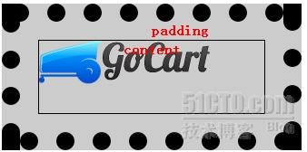
1、background-origin 控制背景图片区域
三个取值,由外向内分别为: border-box,padding-box,content-box
默认为padding-box
- <style type="text/css">
- <!--
- .bg-origin {
- width:250px; border:20px dotted #000; padding:20px; position:relative;
- text-align:center; font-weight:bold; color:#f00;
- background:#ccc url(img/logo.png) no-repeat;
- background-origin:content-box;
- }
- span.bg-padding { position:absolute;top:0; }
- div.bg-content { height:80px; border:1px solid #000; }
- -->
- </style>
- <div class="bg-origin">
- <span class="bg-padding">padding</span>
- <div class="bg-content">content</div>
- </div>
效果如图
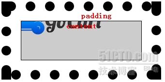
2、background-clip 控制背景图区域,将控制区域外的背景裁切
三个取值,由外向内分别为: border-box,padding-box,content-box
默认取值为border-box
- <style type="text/css">
- <!--
- .bg-clip {
- width:250px; border:20px dotted #000; padding:20px; position:relative;
- text-align:center; font-weight:bold; color:#f00;
- background:#ccc url(img/logo.png) no-repeat;
- background-clip:content-box;
- }
- span.bg-padding { position:absolute;top:0; }
- div.bg-content { height:80px; border:1px solid #000; }
- -->
- </style>
- <div class="bg-clip">
- <span class="bg-padding">padding</span>
- <div class="bg-content">content</div>
- </div>
效果如图:
3、background-size 控制背景图片大小,拉伸控制图片
以像素或百分比控制,基于Gecko引擎的火狐浏览器目前尚不支持
- <style type="text/css">
- <!--
- .bg-size {
- border: 1px solid #CCCCCC; padding:90px 5px 10px;
- background:url(img/logo.png) no-repeat ;
- -webkit-background-size: 100% 80px;
- -o-background-size: 100% 80px;
- }
- -->
- </style>
- <div class="bg-size">这里的<code>background-size: 100% 80px</code> 背景图片将与DIV一样宽,高为80px。</div>
谷歌浏览器下效果:

4、Multiple backgrounds
background 包含一下子属性
background-p_w_picpath : 指定或检索对象的背景图像。
background-origin : 指定背景的显示区域。参见background-origin
background-clip : 指定背景的裁剪区域。参见background-clip
background-repeat : 设置或检索对象的背景图像是否及如何重复铺排。
background-size : 指定背景图片的大小。参见background-size
background-position : 设置或检索对象的背景图像位置。
CSS3手册中有如下介绍:
- CSS3中在容器的多层背景,各子属性与逗号来分隔值,如果指定的值,如下:
- background-p_w_picpath: w1, w2, w3,…, wM
- background-repeat: x1, x2, x3,…, xR
- background-size: y1, y2, y3,…, yS
- background-position: s1, s2, s3,…, sP
各个控制数值一一对应
这边以一个简单的上下左右控制的综合背景图为例
- <style type="text/css">
- <!--
- .mult-bg {
- background-p_w_picpath: url(img/bgt.png),url(img/bgr.png),url(img/bgb.png),url(img/bgl.png);
- background-position: center top, right center, center bottom,left center;
- background-repeat:repeat-x,repeat-y,repeat-x,repeat-y;width:260px;padding:20px;
- }
- -->
- </style>
- <div class="mult-bg"><p>多背景示范容器</p></div>
所用的背景图:
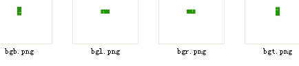
效果如图:

还是由于当前的兼容问题,在做美化的过程中,要尽量做到平稳过度
虽说标准尚未出台,不过先熟悉熟悉总是好事 :-)


