通过transform2D转换我么可以做一些简单的动画效果 以及让页面更规整
- 移动:translate
- 旋转:rotate
- 缩放:scale
本篇文章将会讲解上面这三个属性,文章包含个人理解(错误请指出)
位移 translate
移动元素位置的方法,再2D平面中进行移动,有两个值,第一个值是x轴移动,第二个值是y轴移动,正数向右向下移动,负数向左向上移动。
transform: translate(x, y);
或者分开写
transform: translateX(n);
transform: translateY(n);
注意:
1.translate的移动对行内元素没有效果 像a标签,span标签等行内元素。
2.translate的移动是相对于自身移动的,类似定位中的relative。
3.translate不会脱离标准流,并且不会影响其他元素的位置。
<style>
        div:first-child {
            width: 200px;
            height: 200px;
            background-color: beige;
            transform: translate(100px, 100px);
        }

        div:last-child {
            width: 200px;
            height: 200px;
            background-color: aquamarine;
        }
    </style>
</head>

<body>
    <div></div>
    <div></div>
</body>

也可以写百分比的方式改变位置 根据自己的长宽计算的百分比transform: translate(50%, 50%);
棕绿色的位置 根据自己的长宽进行位置移动,绿色的位置没有变化(不会影响其他的元素)
相对定位
<style>
        div:first-child {
            position: relative;
            width: 200px;
            height: 200px;
            background-color: beige;
            top: 100px;
            left: 100px;
            /* transform: translate(50%, 50%); */
        }

        div:last-child {
            width: 200px;
            height: 200px;
            background-color: aquamarine;
        }
    </style>
</head>

<body>
    <div></div>
    <div></div>
</body>
跟相对定位很相似,会根据自己原来的位置进行移动,移动后原来位置的占有并不会消失,所以不会影响其他元素,同样都是没有脱离标准流。
不同是相对定位的百分比值不是根据自己计算的而是根据父级计算的
旋转 rotate
transform: rotate(度数)
度数是正数时顺时针旋转,负数时逆时针旋转,单位是deg,默认的中心点是元素本身的中心点。
<style>
        /* div:first-child {
            position: relative;
            width: 200px;
            height: 200px;
            background-color: beige;
            top: 100px;
            left: 100px; */
        /* transform: translate(50%, 50%); */
        /* } */
        /*
        div:last-child {
            width: 200px;
            height: 200px;
            background-color: aquamarine;
        } */
        #div1 {
            height: 250px;
            width: 250px;
            border: 1px solid;
        }

        #div2 {
            height: 150px;
            transform: translate(80px, 80px) rotate(-45deg);
            width: 150px;
            border-bottom: 1px solid;
            border-left: 1px solid;
            background-color: blueviolet;

        }
    </style>
</head>

<body>

    <div id="div1">
        <div id="div2"></div>
    </div>
</body>

中心点是可以变化的的
transform-origin
属性值可以是百分比、em、px等具体的值,也可以是top、right、bottom、left和center这样的关键词。
top left等方位名词表示的是顶部左角
transform-origin: top;
比如top 就是红点位置

你可以设置具体的值
transform-origin:50% 0%;
跟top一样 它是从左上角开始的计算 第一个是x轴第二个是y轴 所以跟top一样
例子
<style>
/* div:first-child {
position: relative;
width: 200px;
height: 200px;
background-color: beige;
top: 100px;
left: 100px; */
/* transform: translate(50%, 50%); */
/* } */
/*
div:last-child {
width: 200px;
height: 200px;
background-color: aquamarine;
} */
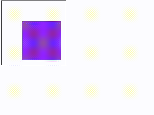
#div1 {
height: 250px;
width: 250px;
border: 1px solid;
}
#div2 {
height: 150px;
transform: translate(80px, 80px);
transform-origin: top;
width: 150px;
border-bottom: 1px solid;
border-left: 1px solid;
background-color: blueviolet;
transition: transform 1s;
}
#div2:hover {
transform: translate(80px, 80px) rotate(-45deg);
}
</style>
</head>
<body>
<div id="div1">
<div id="div2"></div>
</div>
</body>

缩放 scale
transform: scale(x, y);
围绕默认中心点(可修改)进行的缩放,不会影响其他周边元素(优于width和height的地方)
缩小和放大选择对象,x,y理解成宽度和高度即可,里面添加的是要放大的倍数。
transform: scale(1, 1);没有变化
transform: scale(2,,2);放大两倍
transform: scale(0.5, 0.5)缩小一半
<style>
        /* div:first-child {
            position: relative;
            width: 200px;
            height: 200px;
            background-color: beige;
            top: 100px;
            left: 100px; */
        /* transform: translate(50%, 50%); */
        /* } */
        /*
        div:last-child {
            width: 200px;
            height: 200px;
            background-color: aquamarine;
        } */
        #div1 {
            height: 250px;
            width: 250px;
            border: 1px solid;
        }

        #div2 {
            height: 150px;
            transform: translate(80px, 80px);
            transform-origin: top;
            width: 150px;
            border-bottom: 1px solid;
            border-left: 1px solid;
            background-color: blueviolet;
            transition: transform 1s;
        }

        #div2:hover {
            transform: translate(80px, 80px) rotate(-45deg) scale(1.5, 1.5);
        }
    </style>
</head>

<body>

    <div id="div1">
        <div id="div2"></div>
    </div>
</body>
注意:
- 同时使用多个转换,格式为:
transform: translate() rotate() scale() - 其顺序会影转换的效果。(比如先旋转会改变坐标轴方向所以要先位移)


