
大家好,我是 Just,这里是「设计师工作日常」,今天分享的是一个文字按钮链接,当鼠标悬浮时,线条会发生动态变化的效果。
《有趣的css》系列最新实例通过公众号「设计师工作日常」发布。
(目录)
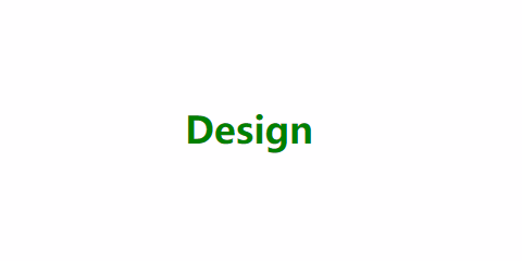
整体效果
这个链接悬浮效果主要用 css3 的
animation属性配合:hover伪选择器来实现的。
此效果可以在文字链接、文字按钮等地方实现一个简单的鼠标交互效果。
核心代码部分,简要说明了写法思路;完整代码在最后,可直接复制到本地运行。
核心代码
html 代码:
<a rel="nofollow" href="javascript:;">
  <span class="a-line"></span>
  Design
</a>
a标签主体,包裹子元素span以及文字元素Design。
css 部分代码:
a{
  text-decoration: none;
  color: green;
  cursor: pointer;
  font-size: 34px;
  font-weight: bold;
}
.a-line{
  width: 0;
  height: 2px;
  display: block;
  margin-bottom: 6px;
  background-color: green;
}
a:hover .a-line{
  width: 100%;
  animation: move .5s ease;
}
@keyframes move{
  from{
    width: 0;
  }
  to{
    width: 100%;
  }
}
css 部分主要通过
:hover伪选择器来设置span子元素样式,然后使用animation来实现span宽度变化。
完整代码如下
html 页面:
<!DOCTYPE html>
<html lang="en">
  <head>
    <meta charset="UTF-8">
    <meta name="viewport" content="width=device-width, initial-scale=1.0">
    <link rel="stylesheet" href="style.css">
    <title>鼠标悬浮线条动态变化</title>
  </head>
  <body>
    <div class="app">
      <a rel="nofollow" href="javascript:;">
        <span class="a-line"></span>
        Design
      </a>
    </div>
  </body>
</html>
css 样式:
/** style.css **/
*{
  margin: 0;
  padding: 0;
  list-style: none;
  transition: .5s;
}
html,body{
  background-color: #fff;
  font-size: 14px;
}
.app{
  width: 100%;
  height: 100vh;
  position: relative;
  display: flex;
  justify-content: center;
  align-items: center;
}
a{
  text-decoration: none;
  color: green;
  cursor: pointer;
  font-size: 34px;
  font-weight: bold;
}
.a-line{
  width: 0;
  height: 2px;
  display: block;
  margin-bottom: 6px;
  background-color: green;
}
a:hover .a-line{
  width: 100%;
  animation: move .5s ease;
}
@keyframes move{
  from{
    width: 0;
  }
  to{
    width: 100%;
  }
}
页面渲染效果:
以上就是所有代码,以及简单的思路,希望对你有一些帮助或者启发。
我是 Just,这里是「设计师工作日常」,求点赞求关注!skr~


