
大家好,我是 Just,这里是「设计师工作日常」,今天分享的是用css 实现一个动态的太极八卦图。
最新文章通过公众号「设计师工作日常」发布。
(目录)
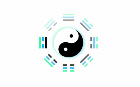
整体效果
知识点: ①
nth-of-type选择器的使用 ② 关于transform中transform-origin的使用方式 ③animation动画和animation-delay延迟参数的使用
思路:先搭建太极阴阳鱼,利用
:before和:after伪元素画出阴阳鱼和鱼眼,然后分别绘制出八个卦象的图形,最后分别给太极阴阳鱼和卦象设置不同的动画参数。
核心代码部分,简要说明了写法思路;完整代码在最后,可直接复制到本地运行。
核心代码
html 代码
<div class="taijibagua">
  <div class="taiji">
    <div class="yu"></div>
  </div>
  <div class="bagua" title="乾 - 天">
  </div>
  <div class="bagua" title="兑 - 泽">
    <div class="white3"></div>
  </div>
  <div class="bagua" title="离 - 火">
    <div class="white2"></div>
  </div>
  <div class="bagua" title="震 - 雷">
    <div class="white2"></div>
    <div class="white3"></div>
  </div>
  <div class="bagua" title="坤 - 地">
    <div class="white1"></div>
    <div class="white2"></div>
    <div class="white3"></div>
  </div>
  <div class="bagua" title="艮 - 山">
    <div class="white1"></div>
    <div class="white2"></div>
  </div>
  <div class="bagua" title="坎 - 水">
    <div class="white1"></div>
    <div class="white3"></div>
  </div>
  <div class="bagua" title="巽 - 风">
    <div class="white1"></div>
  </div>
</div>
太极阴阳鱼以及八卦页面代码部分。
css 部分代码
.taijibagua{
  width: 200px;
  height: 200px;
  display: flex;
  justify-content: center;
  align-items: center;
  position: relative;
}
.taiji{
  width: 100px;
  height: 100px;
  position: relative;
  border-radius: 50%;
  box-shadow: 0px -5px 10px 0px rgba(42,245,152,0.4), 0px 5px 10px 0px rgba(8,174,234,0.4);
  animation: zhuan 5s linear infinite;
}
.taiji:before,.taiji:after{
  content: '';
  width: 100px;
  height: 50px;
  position: absolute;
  background-color: #fff;
  border-radius: 100px 100px 0 0;
}
.taiji:after{
  top: 50px;
  background-color: #000;
  border-radius: 0 0 50px 50px;
}
.yu:before,.yu:after{
  content: '';
  width: 12px;
  height: 12px;
  position: absolute;
  top: 25px;
  left: 50px;
  border-radius: 50%;
  background-color: #000;
  border: 19px solid #fff;
  z-index: 1;
}
.yu:after{
  left: 0;
  background-color: #fff;
  border: 19px solid #000;
}
@keyframes zhuan{
  to {
    transform: rotate(360deg);
  }
}
.bagua{
  width: 40px;
  height: 5px;
  background-color: #2AF598;
  position: absolute;
  top: 0;
  transform-origin: 20px 100px;
  animation: eff49 5s linear infinite;
  opacity: 0.2;
}
.bagua:before,.bagua:after{
  content: '';
  width: 40px;
  height: 5px;
  background-color: #08AEEA;
  position: absolute;
  top: 10px;
}
.bagua:after{
  top: 20px;
  background-color: #000;
}
.taijibagua .bagua:nth-of-type(3){
  transform: rotate(-45deg);
  animation-delay: 4.375s;
}
.taijibagua .bagua:nth-of-type(4){
  transform: rotate(-90deg);
  animation-delay: 3.75s;
}
.taijibagua .bagua:nth-of-type(5){
  transform: rotate(-135deg);
  animation-delay: 3.125s;
}
.taijibagua .bagua:nth-of-type(6){
  transform: rotate(-180deg);
  animation-delay: 2.5s;
}
.taijibagua .bagua:nth-of-type(7){
  transform: rotate(-225deg);
  animation-delay: 1.875s;
}
.taijibagua .bagua:nth-of-type(8){
  transform: rotate(-270deg);
  animation-delay: 1.25s;
}
.taijibagua .bagua:nth-of-type(9){
  transform: rotate(-315deg);
  animation-delay: 0.625s;
}
.white1,.white2,.white3{
  width: 10px;
  height: 7px;
  background-color: #ffffff;
  position: absolute;
  top: -1px;
  left: 50%;
  transform: translate(-50%,0);
  z-index: 10;
}
.white2{
  top: 10px;
}
.white3{
  top: 20px;
}
@keyframes eff49{
  0% {
    opacity: 1;
  }
  100%{
    opacity: 0.2;
  }
}
1、
.taiji:before和.taiji:after伪元素分别绘制黑白阴阳鱼的主体,.yu:before和yu:after伪元素分别绘制黑白阴阳鱼的小鱼眼,然后设置旋转动画,顺时针旋转。
2、
.bagua配合.bagua:before和.bagua:after绘制出三条矩形形状,然后利用不同的.white1、.white2、.white3去遮挡分割矩形,来实现不同的卦象
3、页面中的八个
.bagua通过transform-origin定义旋转圆点,然后用:nth-of-type(n)选择器分别定义八个卦象的旋转角度,让八个卦象分布在太极阴阳鱼四周
4、最后定义动画参数且使用
animation-delay来延迟每个卦象的动画启动时间,来实现卦象随着太极阴阳鱼旋转时,不停亮起的效果。
完整代码如下
html 页面
<!DOCTYPE html>
<html lang="zh">
  <head>
    <meta charset="utf-8">
    <link rel="stylesheet" href="style.css">
    <title>太极八卦图</title>
  </head>
  <body>
    <div class="app">
      <div class="taijibagua">
        <div class="taiji">
          <div class="yu"></div>
        </div>
        <div class="bagua" title="乾 - 天">
        </div>
        <div class="bagua" title="兑 - 泽">
          <div class="white3"></div>
        </div>
        <div class="bagua" title="离 - 火">
          <div class="white2"></div>
        </div>
        <div class="bagua" title="震 - 雷">
          <div class="white2"></div>
          <div class="white3"></div>
        </div>
        <div class="bagua" title="坤 - 地">
          <div class="white1"></div>
          <div class="white2"></div>
          <div class="white3"></div>
        </div>
        <div class="bagua" title="艮 - 山">
          <div class="white1"></div>
          <div class="white2"></div>
        </div>
        <div class="bagua" title="坎 - 水">
          <div class="white1"></div>
          <div class="white3"></div>
        </div>
        <div class="bagua" title="巽 - 风">
          <div class="white1"></div>
        </div>
      </div>
    </div>
  </body>
</html>
css 样式
/** style.css **/
.app{
  width: 100%;
  height: 100vh;
  background-color: #ffffff;
  position: relative;
  display: flex;
  justify-content: center;
  align-items: center;
}
.taijibagua{
  width: 200px;
  height: 200px;
  display: flex;
  justify-content: center;
  align-items: center;
  position: relative;
}
.taiji{
  width: 100px;
  height: 100px;
  position: relative;
  border-radius: 50%;
  box-shadow: 0px -5px 10px 0px rgba(42,245,152,0.4), 0px 5px 10px 0px rgba(8,174,234,0.4);
  animation: zhuan 5s linear infinite;
}
.taiji:before,.taiji:after{
  content: '';
  width: 100px;
  height: 50px;
  position: absolute;
  background-color: #fff;
  border-radius: 100px 100px 0 0;
}
.taiji:after{
  top: 50px;
  background-color: #000;
  border-radius: 0 0 50px 50px;
}
.yu:before,.yu:after{
  content: '';
  width: 12px;
  height: 12px;
  position: absolute;
  top: 25px;
  left: 50px;
  border-radius: 50%;
  background-color: #000;
  border: 19px solid #fff;
  z-index: 1;
}
.yu:after{
  left: 0;
  background-color: #fff;
  border: 19px solid #000;
}
@keyframes zhuan{
  to {
    transform: rotate(360deg);
  }
}
.bagua{
  width: 40px;
  height: 5px;
  background-color: #2AF598;
  position: absolute;
  top: 0;
  transform-origin: 20px 100px;
  animation: eff49 5s linear infinite;
  opacity: 0.2;
}
.bagua:before,.bagua:after{
  content: '';
  width: 40px;
  height: 5px;
  background-color: #08AEEA;
  position: absolute;
  top: 10px;
}
.bagua:after{
  top: 20px;
  background-color: #000;
}
.taijibagua .bagua:nth-of-type(3){
  transform: rotate(-45deg);
  animation-delay: 4.375s;
}
.taijibagua .bagua:nth-of-type(4){
  transform: rotate(-90deg);
  animation-delay: 3.75s;
}
.taijibagua .bagua:nth-of-type(5){
  transform: rotate(-135deg);
  animation-delay: 3.125s;
}
.taijibagua .bagua:nth-of-type(6){
  transform: rotate(-180deg);
  animation-delay: 2.5s;
}
.taijibagua .bagua:nth-of-type(7){
  transform: rotate(-225deg);
  animation-delay: 1.875s;
}
.taijibagua .bagua:nth-of-type(8){
  transform: rotate(-270deg);
  animation-delay: 1.25s;
}
.taijibagua .bagua:nth-of-type(9){
  transform: rotate(-315deg);
  animation-delay: 0.625s;
}
.white1,.white2,.white3{
  width: 10px;
  height: 7px;
  background-color: #ffffff;
  position: absolute;
  top: -1px;
  left: 50%;
  transform: translate(-50%,0);
  z-index: 10;
}
.white2{
  top: 10px;
}
.white3{
  top: 20px;
}
@keyframes eff49{
  0% {
    opacity: 1;
  }
  100%{
    opacity: 0.2;
  }
}
页面渲染效果
以上就是所有代码,以及简单的思路,希望对你有一些帮助或者启发。
我是 Just,这里是「设计师工作日常」,求点赞求关注!


