
上一篇文章已经具体介绍了css过渡的语法和用途,本文将介绍3d与过渡的结合的具体使用。
可以做出各种好看的3D动态效果
回顾一下,过渡的语法:简写:transition:all/具体属性值 运动时间s/ms 延迟时间s/ms 动画类型
案例效果图如下(实现代码在下方):
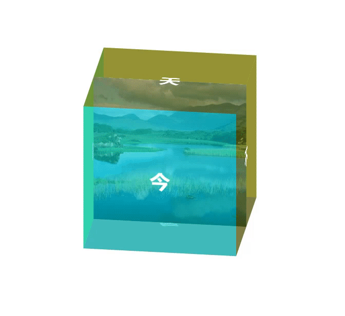
3D
2d场景,在屏幕上水平和垂直的交叉线x轴和y轴
3d场景,在垂直于屏幕的方法,相对于3d多出个z轴
Z轴:靠近屏幕的方向是正向,远离屏幕的方向是反向
实现3D场景
transform-style属性
transform-style属性是3D空间一个重要属性,指定嵌套元素如何在3D空间中呈现。他主要有两个属性值:flat和preserve-3d;
其默认值为flat,即为2D空间。
3D位移
CSS3中的3D位移主要包括translateZ()和translate3d()两个功能函数;
- translate3d(tx,ty,tz)
- ty:代表纵向坐标位移向量的长度;
- tx:代表横向坐标位移向量的长度;
- tz:代表Z轴位移向量的长度。此值不能是一个百分比值,如果取值为百分比值,将会认为无效值。
- translateZ(t)
- 指的是Z轴的向量位移长度。
3D旋转
CSS3中的3D旋转主要包括rotateX()、rotateY()、rotateZ()和rotate3d()四个功能函数;
- rotateX(a)
- rotateX()函数指定一个元素围绕X轴旋转,旋转的量被定义为指定的角度;如果值为正值,元素围绕X轴顺时针旋转;反之,如果值为负值,元素围绕X轴逆时针旋转。
- rotateY(a)
- rotateY()函数指定一个元素围绕Y轴旋转,旋转的量被定义为指定的角度;如果值为正值,元素围绕Y轴顺时针旋转;反之,如果值为负值,元素围绕Y轴逆时针旋转。
- rotateZ(a)
- rotateZ()函数和其他两个函数功能一样的,区别在于rotateZ()函数指定一个元素围绕Z轴旋转
3D缩放
3D缩放:CSS3中的3D缩放主要包括scaleZ()和scale3d()两个功能函数;
- scale3d()
- sx:横向缩放比例;
- sy:纵向缩放比例;
- sz:Z轴缩放比例;
- scaleZ(s)
- s:指定元素每个点在Z轴的比例。
- 注:scaleZ()和scale3d()函数单独使用时没有任何效果,需要配合其他的变形函数一起使用才会有效果
附上案例代码:
<!DOCTYPE html>
<html lang="en">
<head>
    <meta charset="UTF-8">
    <meta name="viewport" content="width=device-width, initial-scale=1.0">
    <title>Document</title>
    <style>
        html,body{
            width: 100%;
            height: 100%;
        }
        .big_box{
            width: 300px;
            height: 300px;
            margin: 150px auto;
            position: relative;
            background: url(./images/1.jpg) center;
            transform-style: preserve-3d;
            animation: boxMore 7s linear infinite;
        }
        .box{
            width: 300px;
            height: 300px;
            line-height: 300px;
            text-align: center;
            font-size: 40px;
            font-weight: bold;
            color: #fff;
            position: absolute;
            top: 0;
        }
        .box1{
            background-color: rgba(0, 200, 200, .6);
            transform: translateZ(150px);
        }
        .box2{
            background-color: rgba(200, 200, 0, .6);
            transform: translateZ(-150px) rotateY(180deg);
        }
        .box3{
            background-color: rgba(100, 100, 0, .6);
            transform: translateY(-150px) rotateX(90deg);
        }
        .box4{
            background-color: rgba(100, 100, 100, .6);
            transform: translateY(150px) rotateX(-90deg);
        }
        .box5{
            background-color: rgba(100, 100, 0, .6);
            transform: translateX(150px) rotateY(90deg);
        }
        .box6{
            background-color: rgba(100, 200, 0, .6);
            transform: translateX(-150px) rotateY(-90deg);
        }
        @keyframes boxMore {
            0%{
                transform: rotateX(0deg) rotateY(0deg);
            }
            25%{
                transform: rotateX(90deg) rotateY(30deg);
            }
            50%{
                transform: rotateX(180deg) rotateY(0deg);
            }
            75%{
                transform: rotateX(270deg) rotateY(-30deg);
            }
            100%{
                transform: rotateX(360deg) rotateY(0deg);
            }
        }
    </style>
</head>
<body>
    <div class="big_box">
        <div class="box box1">今</div>
        <div class="box box2">天</div>
        <div class="box box3">天</div>
        <div class="box box4">气</div>
        <div class="box box5">不</div>
        <div class="box box6">错</div>
    </div>
</body>
</html>
本文章为转载内容,我们尊重原作者对文章享有的著作权。如有内容错误或侵权问题,欢迎原作者联系我们进行内容更正或删除文章。


