
目录
我是c站的一个小博主,近期我会每天分享前端知识包括(原生的web语句,以及vue2和vue3,微信小程序的写法及知识点)本篇文章收录于html特效专栏中,如果想每天在我这学到一些东西,请关注我并订阅专栏,每天都分享前端知识哦~
前端的特效视觉:
1.鼠标悬停图片缩小文字出现
2.跳跳糖版
3.实时时间背景效果
4.滑动简约特效
5.单圈环绕流光加载
1.前端工程师主要利用HMTL与CSS建构页面(其中html构建骨架,css构建样式),用JavaScript获取后端数据以及完善交互以及用户体验。
2.通俗来讲,前端在一个项目里,拿到UI设计师设计的设计稿,然后实现UI设计师设计稿,调用后端程序员给的数据接口以获取数据,然后测试,最后部署上线。
3.前端可以对设计图负责,大部分情况下,不需要特别的去理解业务逻辑,因为我们90后都是玩着十几年手机电脑长大的,十几年的经验足够我们在潜意识里想明白应该怎么做,怎么去一步步实现,会有什么意外情况。
4.我感觉前端发展有个很大的缺陷----晋升问题. 正如第三点所言,作为领导必须对项目有足够的了解,显然是要重点包括业务逻辑,这点上,后端开发者需要涉及数据库逻辑,是必须要跟业务逻辑打交道的(重中之重),因此,大部分的领导岗位都是后端开发者更有晋升的机会。当然,个别公司有专门的前端组长(这也不算什么),如果说前端开发者在自己工作范围之外还要腾出时间去研究业务逻辑,属实是觉得出力不讨好(因为这样的操作需要持续很久才能看出效果),而且再怎么研究业务逻辑也不会比每时每刻跟业务逻辑打交道的后端开发者了解更多。说实在的,大部分情况下,前端在配合后端进行开发.后端需要了解业务逻辑,要跟领导和客户商量细节,露脸机会很大,在老板面前刷脸次数众多。这些都是拉开前后端程序员晋升机会差距的因素。
前端的特效视觉:
层次结构的表现
动态效果,如缩放,覆盖,滑出网页或单个视觉元素,可帮助用户理解网页信息架构。通常是通过转场和菜单来展开网页。
表现层级关系
为了展现层与层的关系,是抽屉,是打开,还是平级切换等等。让用户知道这个界面和上一个、下一个的关系。
清晰明确
动效可以清晰地表明各种数据块中间的逻辑结构,即使在数据高度饱和的情况下也能使一切从观感上有组织性。
添加了图层
在网站制作过程中加上特效,每个元素都在用户滚动页面或者是鼠标经过的地方有动态效果,就像在平面层上多出了一个动态层,这样看起来更加有层次感。
我想借此专栏发布的内容帮助那些正在入坑前端的家人们,同时作为我以后复习的笔记,希望我们可以互相帮助,共同加油!!!
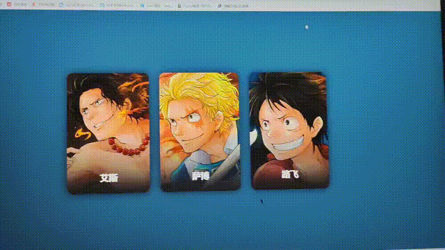
1.鼠标悬停图片缩小文字出现
代码:
<!DOCTYPE html>
<html>

<head>
    <meta http-equiv="content-type" content="text/html; charset=utf-8">
    <meta name="viewport" content="width=device-width,initial-scale=1,maximum-scale=1,user-scalable=no">

    <title>鼠标悬停图片缩小文字出现</title>
    <style>
        *{
    /* 初始化 */
    margin: 0;
    padding: 0;
}
body{
    /* 100%窗口高度 */
    height: 100vh;
    /* 弹性布局 水平+垂直居中 */
    display: flex;
    justify-content: center;
    align-items: center;
    /* 渐变背景 */
    background: linear-gradient(200deg,#517fa4,#243949);
}
.card{
    /* 相对定位 */
    position: relative;
    width: 300px;
    height: 450px;
    margin: 20px;
    background-color: #758a99;
    border-radius: 20px;
    /* 溢出隐藏 */
    overflow: hidden;
    /* 弹性布局 */
    display: flex;
    /* 元素纵向排列 */
    flex-direction: column;
    /* 居中 */
    align-items: center;
    color: #fff;
    /* 阴影 */
    box-shadow: 0 0 30px rgba(0,0,0,0.5);
    /* 不让其被挤压 */
    flex-shrink: 0;
}
.card .photo img{
    width: 100%;
    height: 100%;
    /* 保持原有尺寸比例,裁切长边 */
    object-fit: cover;
}
/* 默认大图 */
.card .photo{
    /* 绝对定位 */
    position: absolute;
    top: 0;
    width: 100%;
    height: 100%;
    border-radius: 0%;
    overflow: hidden;
    /* 动画过渡 */
    transition: 0.5s;
}
/* 鼠标移入变小图 */
.card:hover .photo{
    top: 30px;
    width: 120px;
    height: 120px;
    border-radius: 50%;
    box-shadow: 0 0 20px rgba(0,0,0,0.8);
}
/* 这里加个黑色到透明的渐变背景,可以更好的看清楚名字 */
.card .photo::before{
    content: "";
    position: absolute;
    width: 100%;
    height: 100%;
    background: linear-gradient(to bottom,transparent 50%,#222);
}
.card h1{
    position: absolute;
    top: 370px;
    transition: 0.5s;
}
.card:hover h1{
    top: 170px;
}
.card h2{
    margin-top: 220px;
    width: 80%;
    border-bottom: 1px solid rgba(235, 23, 23, 0.3);
    font-size: 20px;
    text-align: center;
    margin-bottom: 20px;
    padding-bottom: 20px;
}
.card p{
    width: 90%;
    text-indent: 32px;
    font-size: 16px;
    margin-bottom: 15px;
    line-height: 30px;
}
.card a{
    font-size: 14px;
    color: rgba(255,255,255,0.8);
    text-decoration: none;
    border: 1px solid rgba(247, 4, 4, 0.5);
    padding: 8px 32px;
    border-radius: 8px;
}
.card a:hover{
    color: #fff;
    background-color: rgba(255,255,255,0.2);
}
    </style>
</head>

<body>
    <div class="card">
        <div class="photo"><img src="a.jpg" alt=""></div>
        <h1>艾斯</h1>
        <h2>“火拳”艾斯</h2>
        <p>波特卡斯·D·艾斯,日本漫画《航海王》及其衍生作品中的角色。萨博与路飞的结义兄弟。</p>
        <a href="#">了解更多</a>
    </div>
    <div class="card">
        <div class="photo"><img src="s.jpg" alt=""></div>
        <h1>萨博</h1>
        <h2>革命军的二把手</h2>
        <p>萨博,日本漫画《航海王》及其衍生作品中的角色。是路飞与艾斯的结义兄弟。</p>
        <a href="#">了解更多</a>
    </div>
    <div class="card">
        <div class="photo"><img src="l.jpg" alt=""></div>
        <h1>路飞</h1>
        <h2>草帽小子</h2>
        <p>蒙奇·D·路飞,日本漫画《航海王》及其衍生作品中的男主角。是草帽海贼团的船长。</p>
        <a href="#">了解更多</a>
    </div>
</body>

</html>
2.跳跳糖版
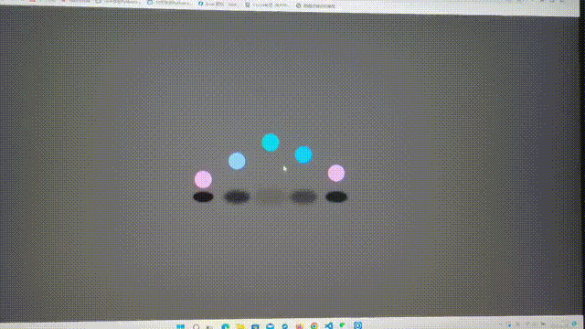
代码:
<!DOCTYPE html>
<html>

<head>
    <meta http-equiv="content-type" content="text/html; charset=utf-8">
    <meta name="viewport" content="width=device-width,initial-scale=1,maximum-scale=1,user-scalable=no">

    <title>跳跳糖版</title>
    <style>
        *{
    /* 初始化 */
    margin: 0;
    padding: 0;
}
body{
    /* 100%窗口高度 */
    height: 100vh;
    /* 弹性布局 水平+垂直居中 */
    display: flex;
    justify-content: center;
    align-items: center;
    background-color: #333;
}
.loader{
    width: 650px;
    height: 200px;
    /* 相对定位 */
    position: relative;
}
/* 小球 */
.loader span.ball{
    width: 50px;
    height: 50px;
    border-radius: 50%;
    background-color: lightseagreen;
    /* 绝对定位 */
    position: absolute;
    /* 通过var函数调用自定义属性--i,计算出每个小球的位置 */
    left: calc(var(--i) * 100px);
    /* 执行动画:动画名 时长 线性的 无限次播放 利用变量让小球的运动拉开时间 */
    animation: jump 2s linear infinite calc(var(--i) * 0.3s);
}
/* 小球阴影 */
.loader span.shadow{
    width: 50px;
    height: 25px;
    border-radius: 50%;
    background-color: #000;
    position: absolute;
    left: calc(var(--i) * 100px);
    bottom: -12.5px;
    z-index: -1;
    animation: shadow 2s linear infinite calc(var(--i) * 0.3s);
}

/* 定义动画 */
/* 小球跳动的动画 */
@keyframes jump {
    0%,100%{
        bottom: 150px;
    }
    40%,60%{
        bottom: 0;
        height: 50px;
    }
    50%{
        height: 25px;
        /* 加个颜色滤镜,改变小球的颜色 */
        /* 可以设置不同的度数来改变颜色 */
        filter: hue-rotate(180deg);
    }
}
/* 小球阴影的变化 */
@keyframes shadow {
    0%,100%{
        transform: scale(2);
        opacity: 0.1;
        /* 模糊滤镜 */
        filter: blur(5px);
    }
    40%,60%{
        transform: scale(1);
        opacity: 1;
        filter: blur(2px);
    }
}
    </style>
</head>

<body>
    <div class="loader">
        <!-- --i为自定义属性,可通过var函数对其调用 -->
        <span class="ball" style="--i:1;"></span>
        <span class="shadow" style="--i:1;"></span>
        <span class="ball" style="--i:2;"></span>
        <span class="shadow" style="--i:2;"></span>
        <span class="ball" style="--i:3;"></span>
        <span class="shadow" style="--i:3;"></span>
        <span class="ball" style="--i:4;"></span>
        <span class="shadow" style="--i:4;"></span>
        <span class="ball" style="--i:5;"></span>
        <span class="shadow" style="--i:5;"></span>
    </div>
</body>

</html>
3.实时时间背景效果
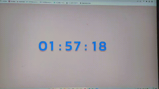
代码:
<!DOCTYPE html>
<html>

<head>
    <meta http-equiv="content-type" content="text/html; charset=utf-8">
    <meta name="viewport" content="width=device-width,initial-scale=1,maximum-scale=1,user-scalable=no">

    <title>实时时间背景</title>
    <style>
        /* 引用网络字体(Kanit字体) */
@import url("http://fonts.googleapis.com/css?family=Kanit");

*{
    /* 初始化 */
    margin: 0;
    padding: 0;
}
body{
    /* 100%窗口高度 */
    height: 100vh;
    /* 弹性布局 水平+垂直居中 */
    display: flex;
    justify-content: center;
    align-items: center;
    /* 背景色:白桃粉 */
    background-color: #eacccc;
    /* 禁止文本被选取 */
    user-select: none;
}
.clock{
    display: flex;
}
.clock p{
    width: 95px;
    font-size: 150px;
    color: rgb(0, 109, 252);
    text-align: center;
    /* 设置字体 */
    font-family: "Kanit";
    font-weight: 900;
    /* 文字阴影 实现3D效果 */
    text-shadow: 0 1px 0 #deafaf,
    0 2px 0 #bda8a8,
    0 3px 0 #d8a1a1,
    0 4px 0 #d59999,
    0 5px 0 #d29292,
    0 6px 0 #cf8b8b,
    0 7px 0 #cc8484,
    0 8px 0 #c97d7d,
    0 0 5px rgba(231,156,156,0.05),
    0 -1px 3px rgba(231,156,156,0.2),
    0 9px 9px rgba(231,156,156,0.3),
    0 12px 12px rgba(231,156,156,0.3),
    0 15px 15px rgba(231,156,156,0.3);
}
    </style>
    <script type="text/javascript">
        function myTime(){
            let time=new Date();
            let hh=time.getHours();  //时
            let mm=time.getMinutes();  //分
            let ss=time.getSeconds();  //秒
            // Math.floor() 向下取整
            document.getElementById("1").innerText=Math.floor(hh/10);
            document.getElementById("2").innerText=hh%10;
            document.getElementById("4").innerText=Math.floor(mm/10);
            document.getElementById("5").innerText=mm%10;
            document.getElementById("7").innerText=Math.floor(ss/10);
            document.getElementById("8").innerText=ss%10;
        }
        // 一秒执行一次
        setInterval(myTime,1000);
    </script>
</head>

<body>
    <div class="clock">
        <p id="1">0</p>
        <p id="2">0</p>
        <p id="3">:</p>
        <p id="4">0</p>
        <p id="5">0</p>
        <p id="6">:</p>
        <p id="7">0</p>
        <p id="8">0</p>
    </div>
</body>

</html>
4.滑动简约特效
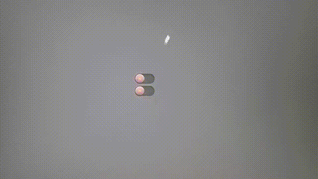
代码:
<!DOCTYPE html>
<html>

<head>
    <meta http-equiv="content-type" content="text/html; charset=utf-8">
    <meta name="viewport" content="width=device-width,initial-scale=1,maximum-scale=1,user-scalable=no">

    <title>滑动简约特效</title>
    <style>
        *{
    /* 初始化 */
    margin: 0;
    padding: 0;
}
body{
    /* 100%窗口高度 */
    height: 100vh;
    /* 弹性布局 水平+垂直居中 */
    display: flex;
    justify-content: center;
    align-items: center;
    background-color: #2b2b2b;
}
.container{
    /* 弹性布局 纵向排列 */
    display: flex;
    flex-direction: column;
}
.container label{
    /* 相对定位 */
    position: relative;
    margin: 5px 0;
    cursor: pointer;
}
.container label span{
    position: relative;
    display: block;
    width: 80px;
    height: 40px;
    background-color: #222;
    border-radius: 40px;
    /* 内阴影 */
    box-shadow: inset 0 2px 15px rgba(0,0,0,0.2),
    inset 0 2px 2px rgba(0,0,0,0.2),
    inset 0 -1px 1px rgba(0,0,0,0.2);
}
/* 滑块 */
.container label .indicator{
    /* 绝对定位 */
    position: absolute;
    left: 0;
    top: 0;
    width: 40px;
    height: 40px;
    /* 渐变背景 */
    background: linear-gradient(to bottom,#444,#222);
    border-radius: 50%;
    /* 阴影 */
    box-shadow: 0 2px 5px rgba(0,0,0,0.5),
    inset 0 1px 1px rgba(255,255,255,0.1);
    /* 缩小 */
    transform: scale(0.9);
    /* 动画过渡 */
    transition: 0.5s;
}
/* 滑块中心的发光点 */
.container label .indicator::before{
    content: "";
    width: 5px;
    height: 5px;
    /* 绝对定位 居中 */
    position: absolute;
    left: 50%;
    top: 50%;
    transform: translate(-50%,-50%);
    background-color: #f00;
    border-radius: 50%;
    /* 阴影制造发光效果 */
    box-shadow: 0 0 2px #f00,
    0 0 5px #f00,
    0 0 10px #f00,
    0 0 15px #f00,
    0 0 20px #f00,
    0 0 25px #f00,
    0 0 30px #f00,
    0 0 35px #f00;
    transition: 0.5s;
}
/* 勾选复选框后滑块的变化 */
.container label input:checked ~ .indicator{
    left: 40px;
}
.container label input:checked ~ .indicator::before{
    background-color: #0f0;
    box-shadow: 0 0 2px #0f0,
    0 0 5px #0f0,
    0 0 10px #0f0,
    0 0 15px #0f0,
    0 0 20px #0f0,
    0 0 25px #0f0,
    0 0 30px #0f0,
    0 0 35px #0f0;
}
    </style>
</head>

<body>
    <div class="container">
        <label>
            <input type="checkbox" hidden>
            <span></span>
            <i class="indicator"></i>
        </label>
        <label>
            <input type="checkbox" hidden checked>
            <span></span>
            <i class="indicator"></i>
        </label>
    </div>
</body>

</html>
5.单圈环绕流光加载
代码:
<!DOCTYPE html>
<html>

<head>
    <meta http-equiv="content-type" content="text/html; charset=utf-8">
    <meta name="viewport" content="width=device-width,initial-scale=1,maximum-scale=1,user-scalable=no">

    <title>单圈环绕流光</title>
    <style>
        *{
    /* 初始化 */
    margin: 0;
    padding: 0;
}
body{
    /* 100%窗口高度 */
    height: 100vh;
    /* 弹性布局 水平+垂直居中 */
    display: flex;
    justify-content: center;
    align-items: center;
    background-color: #000;
}
.loader{
    /* 相对定位 */
    position: relative;
    width: 240px;
    height: 240px;
    /* 渐变背景 金色到透明 */
    background: linear-gradient(gold,transparent 40%);
    border-radius: 50%;
    /* 执行动画:动画名 时长 线性 无限次播放 */
    animation: roll 1s linear infinite;
}
/* 遮罩层 */
.loader::before{
    content: "";
    width: calc(100% - 20px);
    height: calc(100% - 20px);
    background-color: #000;
    /* 绝对定位 居中 */
    position: absolute;
    left: 50%;
    top: 50%;
    transform: translate(-50%,-50%);
    border-radius: 50%;
}
.loader::after{
    content: "";
    position: absolute;
    width: 100%;
    height: 100%;
    background: linear-gradient(gold,transparent 40%);
    border-radius: 50%;
    /* 模糊滤镜 */
    filter: blur(30px);
    z-index: -1;
}

/* 定义动画 */
@keyframes roll{
    to{
        transform: rotateZ(360deg);
        /* 转动时再加个颜色变化 */
        /* 颜色滤镜 通过设置度数可改变颜色 */
        filter: hue-rotate(360deg);
    }
}
    </style>
</head>

<body>
    <div class="loader"></div>
</body>

</html>


