
我的项目中使用了scss,elementui官网提供了解决方案如下:
在项目中改变 SCSS 变量

Element 的 theme-chalk 使用 SCSS 编写,如果你的项目也使用了 SCSS,那么可以直接在项目中改变 Element 的样式变量。
1. 新建一个样式文件,例如 element-variables.scss,写入以下内容:

/* 改变主题色变量 */
$--color-primary: teal;

/* 改变 icon 字体路径变量,必需 */
$--font-path: '~element-ui/lib/theme-chalk/fonts';

@import "~element-ui/packages/theme-chalk/src/index";

2. 之后,在项目的入口文件中,直接引入以上样式文件即可(无需引入 Element 编译好的 CSS 文件):

import Vue from 'vue'
import Element from 'element-ui'
import './element-variables.scss'

Vue.use(Element)
需要注意的是,覆盖字体路径变量是必需的,将其赋值为 Element 中 icon 图标所在的相对路径即可。
以上方法,我们修改主题色变量 $--color-primary 的值,然后在项目入口文件 main.js 中引入该样式文件,覆盖elementui的css文件,即可实现换肤。
那么怎么做到自定义任意颜色的主题呢?大致思路如下:
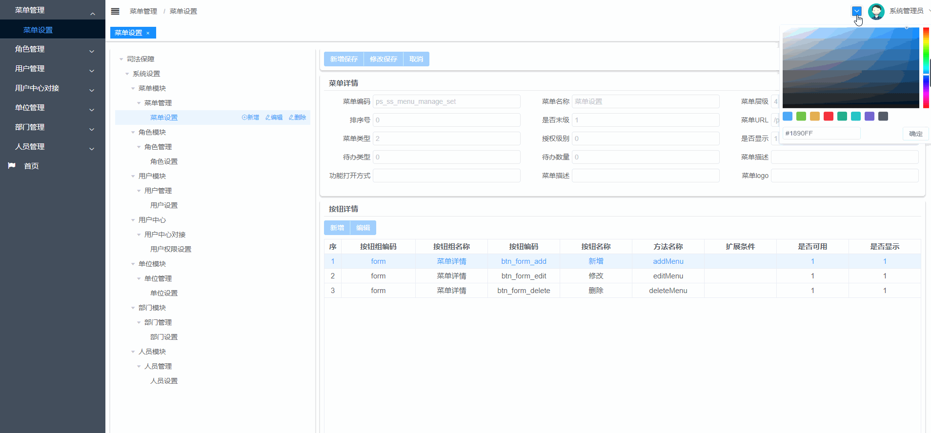
- 1.使用 el-color-picker 组件,供用户选择颜色
- 2.监听颜色的变化,创建 style 标签,生成样式内容
- 3.将创建好的样式内容插入 head 中
实际步骤如下:
- 1.在项目中新建一个scss文件,比如就叫 elementui-variables.scss

内容如下:
/* theme color */
$--color-primary: #1890ff;
$--color-success: #13ce66;
$--color-warning: #FFBA00;
$--color-danger: #ff4949;
// $--color-info: #1E1E1E;

$--button-font-weight: 400;

// $--color-text-regular: #1f2d3d;

$--border-color-light: #dfe4ed;
$--border-color-lighter: #e6ebf5;

$--table-border:1px solid #dfe6ec;

/* icon font path, required */
$--font-path: '~element-ui/lib/theme-chalk/fonts';

// @import "~element-ui/packages/theme-chalk/src/index";

:export {
  theme: $--color-primary;
}- 2.考虑到项目全局都有可能使用到颜色这个变量,所以决定用vuex,如图:新建文件 settings.js

settings.js 内容如下,theme 的初始值为 elementui-variables.scss 中定义的theme。
import variables from '@/styles/element-variables.scss'

const settings = {
  state: {
    theme: variables.theme,
  },
  mutations: {
    CHANGE_SETTING: (state, { key, value }) => {
      if (state.hasOwnProperty(key)) {
        state[key] = value
      }
    }
  },
  actions: {
    changeSetting({ commit }, data) {
      commit('CHANGE_SETTING', data)
    }
  }

}

export default settings
- 3.新建一个组件(一般在components目录下,我将它命名为ThemePicker),用于监听颜色变量 theme 的改变,然后 getHandler 函数生成样式文件,插入head中。在这里我遇到了一个问题,如果使用 document.head.appendChild(styleTag) ,页面就会变成一片空白,然后我就在想有可能是样式的顺序导致一些有用的样式被覆盖了,所以我就讲它改为 document.getElementsByTagName('style')[0].insertBefore(styleTag, null) ; 完美解决问题。
ThemePicker文件内容如下,可以看到默认的颜色是 this.$store.state.settings.theme ,它是在 elementui-variables.scss 中定义的。
<template>
  <el-color-picker
    v-model="theme"
    :predefine="['#409EFF', '#67C23A', '#E6A23C', '#f5222d', '#11a983', '#13c2c2', '#6959CD', '#434f5d', ]"
    class="theme-picker"
    popper-class="theme-picker-dropdown" title="换肤"
  />
</template>

<script>
const version = require('element-ui/package.json').version // element-ui version from node_modules
const ORIGINAL_THEME = '#409EFF' // default color

export default {
  data() {
    return {
      chalk: '', // content of theme-chalk css
      theme: ''
    }
  },
  computed: {
    defaultTheme() {
      return this.$store.state.settings.theme
    }
  },
  watch: {
    defaultTheme: {
      handler: function(val, oldVal) {
        this.theme = val
      },
      immediate: true
    },
    async theme(val) {
      const oldVal = this.chalk ? this.theme : ORIGINAL_THEME
      if (typeof val !== 'string') return
      const themeCluster = this.getThemeCluster(val.replace('#', ''))
      const originalCluster = this.getThemeCluster(oldVal.replace('#', ''))
      // console.log(themeCluster, originalCluster)

      const $message = this.$message({
        message: '更换主题中...',
        customClass: 'theme-message',
        type: 'success',
        duration: 0,
        iconClass: 'el-icon-loading'
      })

      const getHandler = (variable, id) => {
        return () => {
          const originalCluster = this.getThemeCluster(ORIGINAL_THEME.replace('#', ''))
          const newStyle = this.updateStyle(this[variable], originalCluster, themeCluster)

          let styleTag = document.getElementById(id)

          if (!styleTag) {
            styleTag = document.createElement('style')
            styleTag.setAttribute('id', id)

            // document.head.appendChild(styleTag)
            document.getElementsByTagName('style')[0].insertBefore(styleTag, null)
          }
          styleTag.innerText = newStyle
        }
      }

      if (!this.chalk) {
        const url = `https://unpkg.com/element-ui@${version}/lib/theme-chalk/index.css`
        await this.getCSSString(url, 'chalk')
      }

      const chalkHandler = getHandler('chalk', 'chalk-style')

      chalkHandler()

      const styles = [].slice.call(document.querySelectorAll('style'))
        .filter(style => {
          const text = style.innerText
          return new RegExp(oldVal, 'i').test(text) && !/Chalk Variables/.test(text)
        })
      styles.forEach(style => {
        const { innerText } = style
        if (typeof innerText !== 'string') return
        style.innerText = this.updateStyle(innerText, originalCluster, themeCluster)
      })

      this.$emit('change', val)

      $message.close()
    }
  },

  methods: {
    updateStyle(style, oldCluster, newCluster) {
      let newStyle = style
      oldCluster.forEach((color, index) => {
        newStyle = newStyle.replace(new RegExp(color, 'ig'), newCluster[index])
      })
      return newStyle
    },

    getCSSString(url, variable) {
      return new Promise(resolve => {
        const xhr = new XMLHttpRequest()
        xhr.onreadystatechange = () => {
          if (xhr.readyState === 4 && xhr.status === 200) {
            this[variable] = xhr.responseText.replace(/@font-face{[^}]+}/, '')
            resolve()
          }
        }
        xhr.open('GET', url)
        xhr.send()
      })
    },

    getThemeCluster(theme) {
      const tintColor = (color, tint) => {
        let red = parseInt(color.slice(0, 2), 16)
        let green = parseInt(color.slice(2, 4), 16)
        let blue = parseInt(color.slice(4, 6), 16)

        if (tint === 0) { // when primary color is in its rgb space
          return [red, green, blue].join(',')
        } else {
          red += Math.round(tint * (255 - red))
          green += Math.round(tint * (255 - green))
          blue += Math.round(tint * (255 - blue))

          red = red.toString(16)
          green = green.toString(16)
          blue = blue.toString(16)

          return `#${red}${green}${blue}`
        }
      }

      const shadeColor = (color, shade) => {
        let red = parseInt(color.slice(0, 2), 16)
        let green = parseInt(color.slice(2, 4), 16)
        let blue = parseInt(color.slice(4, 6), 16)

        red = Math.round((1 - shade) * red)
        green = Math.round((1 - shade) * green)
        blue = Math.round((1 - shade) * blue)

        red = red.toString(16)
        green = green.toString(16)
        blue = blue.toString(16)

        return `#${red}${green}${blue}`
      }

      const clusters = [theme]
      for (let i = 0; i <= 9; i++) {
        clusters.push(tintColor(theme, Number((i / 10).toFixed(2))))
      }
      clusters.push(shadeColor(theme, 0.1))
      return clusters
    }
  }
}
</script>

<style>
.theme-picker {
  float: left;
  margin-top: 10px;
}

.theme-message,
.theme-picker-dropdown {
  z-index: 99999 !important;
}

.theme-picker .el-color-picker__trigger {
  height: 26px !important;
  width: 26px !important;
  padding: 2px;
}


.theme-picker-dropdown .el-color-dropdown__link-btn {
  display: none;
}
</style>
页面上有些组件的样式可能是自定义的,不会随 theme 一起变化,可这么实现:
<router-link v-for="tag in Array.from(visitedViews)" ref="tag" :style="isActive(tag)?{
        'background-color': theme,
        'color': '#ffffff',
        'border-color': theme
        }:{}"
        :to="tag" :key="tag.path" class="tags-view-item">
        {{ tag.name }}
        <span class="el-icon-close" @click.prevent.stop="closeSelectedTag(tag)"/>
     </router-link>
computed: {
//...,
theme() {
return this.$store.state.settings.theme
}
},- 4.最后在页面上使用 ThemePicker 组件即可:


实际效果录屏:
本文章为转载内容,我们尊重原作者对文章享有的著作权。如有内容错误或侵权问题,欢迎原作者联系我们进行内容更正或删除文章。


