
Material Design 的一些UI 平常开发还是用的比较多的,以前没写,最近总结一下,写一篇博客,要求版本在5.0以上。
主要介绍了FloatActionButton,CoordinatorLayout,CollapsingToolbarLayout,AppBarLayout,Toolbar,TabLayout,RecyclerView,CardView
案例中包含了这些的使用;
使用前在build.gradle 添加
compile 'com.android.support:appcompat-v7:24.2.1'
    compile 'com.jaeger.statusbaruitl:library:1.1.1'
    compile 'com.android.support:design:24.2.+'
    compile 'com.android.support:cardview-v7:24.2.1'
1:FloatActionButton(悬浮按钮)
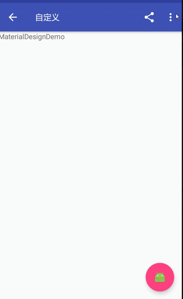
FloatActionButton是ImageButton的继承类,其用法跟普通的Button基本类似,悬浮的效果,故其使用的重点其实是在布局上。
效果如图:
<android.support.design.widget.FloatingActionButton
        android:id="@+id/fab"
        android:layout_width="wrap_content"
        android:layout_height="wrap_content"
        android:layout_margin="15dp"
        android:layout_gravity="bottom|right"
        app:fabSize="normal"
        app:elevation="6dp"
        android:src="@mipmap/ic_launcher"
        app:pressedTranslationZ="25dp"
/>结合Snackbar使用
属性介绍:
1、app:borderWidth=""------------------边框宽度,通常设置为0 ,用于解决Android 5.X设备上阴影无法正常显示的问题
2、app:backgroundTint=""---------------按钮的背景颜色,不设置,默认使用theme中colorAccent的颜色
3、app:rippleColor=""--------------------点击的边缘阴影颜色
4、app:elevation=""----------------------边缘阴影的宽度
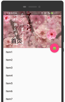
5、app:pressedTranslationZ="16dp"-----点击按钮时,按钮边缘阴影的宽度,通常设置比elevation的数值大2:CoordinatorLayout+AppBarLayout+CollapsingToolbarLayout(工具栏伸缩折叠)
实现Material Design里折叠工具栏,它继承至FrameLayout,给它设置layout_scrollFlags,
它可以控制包含在CollapsingToolbarLayout中的控件(如:ImageView、Toolbar)在响应layout_behavior事件时作出相应的scrollFlags滚动事件(移除屏幕或固定在屏幕顶端)。
效果如图:
实现效果图的代码:
<?xml version="1.0" encoding="utf-8"?>
<android.support.design.widget.CoordinatorLayout xmlns:android="http://schemas.android.com/apk/res/android"
    xmlns:app="http://schemas.android.com/apk/res-auto"
    android:id="@+id/main_content"
    android:layout_width="match_parent"
    android:layout_height="match_parent"
    android:fitsSystemWindows="true">

    <android.support.design.widget.AppBarLayout
        android:id="@+id/appbar"
        android:layout_width="match_parent"
        android:layout_height="226dp"
        android:theme="@style/ThemeOverlay.AppCompat.Dark.ActionBar"
        android:fitsSystemWindows="true">

        <android.support.design.widget.CollapsingToolbarLayout
            android:id="@+id/collapsing_toolbar"
            android:layout_width="match_parent"
            android:layout_height="match_parent"
            app:layout_scrollFlags="scroll|exitUntilCollapsed"
            android:fitsSystemWindows="true"
            app:contentScrim="?attr/colorPrimary"
            app:expandedTitleMarginStart="48dp"
            app:expandedTitleMarginEnd="64dp">

            <ImageView
                app:layout_scrollFlags="scroll|enterAlways|enterAlwaysCollapsed"
                android:id="@+id/backdrop"
                android:layout_width="match_parent"
                android:layout_height="match_parent"
                android:scaleType="centerCrop"
                android:fitsSystemWindows="true"
                android:src="@mipmap/zhangwo_hometop1"
                app:layout_collapseMode="parallax"
                />
            <android.support.v7.widget.Toolbar
                android:id="@+id/toolbar"
                android:layout_width="match_parent"
                android:layout_height="?attr/actionBarSize"
                app:popupTheme="@style/ThemeOverlay.AppCompat.Light"
                app:layout_collapseMode="pin" />

        </android.support.design.widget.CollapsingToolbarLayout>

    </android.support.design.widget.AppBarLayout>

    <android.support.v4.widget.NestedScrollView
        android:layout_width="match_parent"
        android:layout_height="match_parent"
        app:layout_behavior="@string/appbar_scrolling_view_behavior">
        <android.support.v7.widget.RecyclerView
            android:id="@+id/recyclerView"
            android:layout_width="match_parent"
            android:layout_height="match_parent"
            android:scrollbars="none" />

    </android.support.v4.widget.NestedScrollView>

    <android.support.design.widget.FloatingActionButton
        android:id="@+id/fab"
        android:layout_height="wrap_content"
        android:layout_width="wrap_content"
        app:layout_anchor="@id/appbar"
        app:layout_anchorGravity="bottom|right|end"
        android:src="@mipmap/ic_launcher"
        android:layout_margin="15dp"
        android:clickable="true"/>

</android.support.design.widget.CoordinatorLayout>
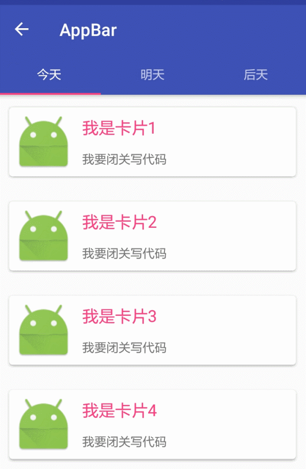
3:CoordinatorLayout+AppBarLayout+TabLayout(工具栏伸缩折叠)
CoordinatorLayout是support.design包中的控件,它可以说是Design库中最重要的控件,
CoordinatorLayout 实现了多种Material Design中提到的滚动效果。
效果图:
效果图布局
<?xml version="1.0" encoding="utf-8"?>
<android.support.design.widget.CoordinatorLayout xmlns:android="http://schemas.android.com/apk/res/android"
    xmlns:app="http://schemas.android.com/apk/res-auto"
    android:layout_width="match_parent"
    android:layout_height="match_parent"
    android:orientation="vertical">

    <android.support.design.widget.AppBarLayout
        android:layout_width="match_parent"
        android:layout_height="wrap_content"
        android:theme="@style/ThemeOverlay.AppCompat.Dark.ActionBar">

        <!--app:layout_scrollFlags
        1、scroll: 所有想滚动出屏幕的view都需要设置这个flag,
        没有设置这个flag的view将被固定在屏幕顶部。
        例如,TabLayout 没有设置这个值,将会停留在屏幕顶部。
        2、enterAlways: 设置这个flag时,向下的滚动都会导致该view变为可见,启用快速“返回模式”。
        3、enterAlwaysCollapsed: 当你的视图已经设置minHeight属性又使用此标志时,
        你的视图只能已最小高度进入,只有当滚动视图到达顶部时才扩大到完整高度。
        4、exitUntilCollapsed: 滚动退出屏幕,最后折叠在顶端。-->

        <android.support.v7.widget.Toolbar
            android:id="@+id/appbar_toolbar"
            app:layout_scrollFlags="scroll|enterAlways"
            app:popupTheme="@style/Theme.AppCompat.Light"
            android:layout_width="match_parent"
            android:layout_height="?attr/actionBarSize"
            android:background="?attr/colorPrimary" />

        <android.support.design.widget.TabLayout
            android:id="@+id/tabs"
            app:tabGravity="fill"
            app:tabMode="fixed"
            android:layout_width="match_parent"
            android:layout_height="wrap_content" />

    </android.support.design.widget.AppBarLayout>
    <android.support.v4.view.ViewPager
        android:id="@+id/viewpager"
        android:layout_width="match_parent"
        android:layout_height="match_parent"
        app:layout_behavior="@string/appbar_scrolling_view_behavior" />
    <!--三:滑动组件的动画,满一屏才有效果。
    app:layout_behavior=”@string/appbar_scrolling_view_behavior”
    -->

</android.support.design.widget.CoordinatorLayout>


