
前言
上一篇实现了基本的样式
这次把旋转动画啥的也加上
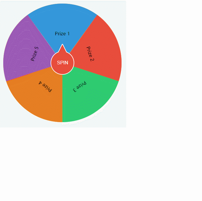
完成的效果如图
思路
利用transform的ratate旋转大转盘外部容器
根据随机数得到中奖元素的下标
然后计算出应该旋转多少度中奖元素才能正好停在12点位置
设置动画的贝赛尔曲线,达到旋转越来越快然后慢慢停止
还可以增加固定几圈,让大转盘多转一会儿,比如定好5圈
代码实现
HTML代码
代码
和上篇区别不大,只是增加了启动按钮,然后做了样式处理
其中12点位置的小尖尖使用的是SVG实现的
<div class="container">
  <div class="wheel">
    <div class="prize">Prize 1</div>
    <div class="prize">Prize 2</div>
    <div class="prize">Prize 3</div>
    <div class="prize">Prize 4</div>
    <div class="prize">Prize 5</div>
    <!-- <div class="prize">Prize 6</div> -->
    <!-- <div class="prize">Prize 7</div>
    <div class="prize">Prize 8</div> -->
  </div>
  <button class="spin" onClick="raffle()">
    SPIN
    <svg>
      <polyline points="2 30, 15 4, 28 30"/>
      <polygon points="2 30, 15 4, 28 30" />
    </svg>
  </button>
</div>
解说
SVG标签内用到了多边形和折线标签,points中写的是节点的坐标位置
CSS代码
代码
body {
    display: flex;
    justify-content: center;
    align-items: center;
    height: 100vh;
    margin: 0;
    background-color: #f7f7f7;
  }

  .container {
    text-align: center;
    overflow: hidden;
  }

  .wheel {
    width: 400px;
    height: 400px;
    position: relative;
    background-color: #f39c12;
    border-radius: 50%;
    overflow: hidden;
  }

  .prize {
    width: 100%;
    height: 50%;
    position: absolute;
    top: 0;
    left: 0;
    display: flex;
    justify-content: center;
    align-items: center;
    box-sizing: border-box;
    transform-origin: center bottom;
  }

  .prize:nth-child(1) { background-color: #3498db; }
  .prize:nth-child(2) { background-color: #e74c3c; }
  .prize:nth-child(3) { background-color: #2ecc71; }
  .prize:nth-child(4) { background-color: #e67e22; }
  .prize:nth-child(5) { background-color: #9b59b6; }
  .prize:nth-child(6) { background-color: #f1c40f; }
  .prize:nth-child(7) { background-color: #1abc9c; }
  .prize:nth-child(8) { background-color: #34495e; }

  .spin {
    background-color: #e74c3c;
    color: #fff;
    padding: 10px 20px;
    border-radius: 50%;
    cursor: pointer;
    font-size: 16px;
    width: 80px;
    height: 80px;
    position: absolute;
    left: calc( 50% - 40px );
    top: calc( 50% - 40px );
    border: 2px solid white;
  }
  .spin svg{
    width: 30px;
    height: 30px;
    position: absolute;
    left: calc( 50% - 15px );
    top: -28px;
  }
  .spin svg polyline{
    stroke:white;
    stroke-width: 4px;
    stroke-linejoin: round;
  }
  .spin svg polygon{
    fill:#e74c3c;
  }

  .myraffle{
    animation: raffle 5s cubic-bezier(0.76, 0.01, 0.21, 0.99);
  }
  @keyframes raffle {
    form{
      transform: rotate(0deg);
    }
    to{
      transform: rotate(var(--final-rotate));
    }
  }
解说
上面的代码上篇已经解释过,主要是说一下.spin,.myraffle,.reffle相关的代码
spin主要是实现了中间的启动按钮,主要是说说上面的小尖尖,刚说过用的SVG实现的
设置SVG的宽高
设置SVG中polyline标签的边框颜色,宽度,中间点样式
设置SVG中polygon标签的填充色,这样三角形就把折线盖住,正好漏出边线
myraffle定义使用一个动画,5秒完成,并设置了贝赛尔曲线,使之慢始慢终中间快
raffle定义了一个动画,最终旋转角度为计算得出
JS代码
代码
// 已知直角长边100,该边与斜边夹角20度,求直角短边
// Math.sin(20/180*Math.PI)*100
var items;
window.onload = ()=>{
  init();
}

function init(){
  // 获取奖项列表
  items = document.querySelectorAll('.prize');
  setItemStyle();
}

/**
 * @description: 根据已知条件计算出clip-path的切割路径
 * @param {*} height 矩形的高
 * @param {*} width 矩形的宽
 * @return {*}
 */
function getPath(height, width){
  // 得出每个奖项的角度,然后除以2得出夹角度数
  let jiaodu = 360 / items.length / 2;
  // 得出短直角边的长度
  let duan = (width/2) - Math.tan(jiaodu/180*Math.PI)*height;
  // let duan = Math.sin(jiaodu*Math.PI/180)*height;
  // 拼接路径信息
  let path = `M ${duan} 0 L ${width-duan} 0 L ${width/2} ${height}`;
  return path;
}

/**
 * @description: 得出奖项旋转角度
 * @return {*}
 */
function getRotate(){
  // 获取奖项列表
  // 得出每个奖项的旋转角度
  return jiaodu = 360 / items.length;
}

/**
 * @description: 设置样式
 * @return {*}
 */
function setItemStyle(){
  // 获取奖项列表
  let path = getPath(200,400);
  let jiaodu = getRotate();
  let jiao = 0;
  for (const item of items) {
    item.style.transform = 'rotate('+jiao+'deg)';
    item.style.clipPath = "path('"+path+"')";
    jiao += jiaodu;
  }
}

// 抽奖动画
function raffle(){
  // 设置中奖奖项下标,从0开始
  let index = Math.floor(Math.random() * items.length);
  // 至少旋转8圈
  let circle = 8;
  // 计算出转盘旋转多少度
  let rotate = 360 - 360 / items.length * index;
  // 得出一共多少度
  let finalRotate = rotate + circle * 360;
  // 设置目标角度
  let wheel = document.querySelector('.wheel');
  wheel.style.setProperty('--final-rotate',finalRotate + 'deg');
  // 设置动画类
  wheel.classList.add('myraffle');
  // 动画结束后
  wheel.onanimationend  = function(){
    // 弹出中奖弹框
    alert("恭喜您中奖:"+items[index].innerText);
    wheel.classList.remove('myraffle');
  }
}
解说
就说raffle函数,上面的函数在上一篇已经解说了
根据奖项数量获取随机数
设置为至少旋转8圈
计算出应该旋转多少度正好停在12点位置,这里用360减去度数是因为度数是顺时针旋转
比如一共5个奖项,中奖了第2个,那么得出来的角度就是72°,旋转72°时12点位置是奖项5而不是奖项2,应该是反方向角度才对,所以用360减去。
将 8圈*360 + 真实的角度 得出外部容器旋转的角度,然后设置css变量值
将外部容器加上动画类,开始旋转
外部容器加上动画完成事件,当动画完成时删除动画类
总结
这里就基本完成了大转盘的效果
用到的也都是之前说过的知识


