
在 HarmonyOS 应用开发中,TextInput 组件是非常常用的一个 UI 元素。本文将介绍如何针对不同的场景对 TextInput 进行自定义,以实现更加丰富和实用的功能。
场景一:实现输入框热搜词自动滚动及文字内容颜色渐变
本场景中,我们将实现一个带有自动滚动热搜词的输入框。当输入框获得焦点时,热搜词将停止滚动,并且文字内容会在到达输入框右侧时显示颜色渐变效果。
Row() {
  Stack() {
    // 使用 Stack 堆叠 Swiper 和 TextInput 组件
    Swiper()
      .displayMode(SwiperDisplayMode.STRETCH)
      .visibility(this.textData ? Visibility.Hidden : Visibility.Visible)
      .loop(true)
      .autoPlay(this.isAutoPlay)
      .vertical(true)
      .indicator(false)
      .interval(SWIPER_INTERVAL)
      .onChange((index) => { this.swiperIndex = index; })
      // 使用 ForEach 组件循环搜索关键字数据
      ForEach(SEARCH_TEXT, (item: SearchTextModel) => {
        Text(item.searchText)
          .opacity(TEXT_OPACITY)
          .fontColor('#000000')
          .fontSize(14)
          .textAlign(TextAlign.Start)
          .width('100%')
      }, (item: SearchTextModel) => item.id.toString())
    TextInput({ text: this.textData, controller: this.controller })
      .onChange((data) => { this.textData = data; })
      .onEditChange((isEditing) => {
        // 通过判断编辑态控制 Swiper 组件开始和暂停滚动
        this.isAutoPlay = !isEditing;
      })
      .maxLines(MAX_LINE)
      .width('100%')
      .height(40)
      // 设置输入框右边内容显示区域渐显效果
      .linearGradient({
        angle: 90,
        colors: [['rgba(0, 0, 0, 0)', 0], ['rgba(0, 0, 0, 1)', 0], ['rgba(0, 0, 0, 1)', 0.85],
          ['rgba(0, 0, 0, 0)', 1]]
      })
      .blendMode(BlendMode.SRC_IN, BlendApplyType.OFFSCREEN)
  }
  .width('80%')
  .height(100)
}
场景二:修改 placeholder 提示文字的大小
此场景中,我们需要调整输入框的占位符(placeholder)文本的大小和颜色。
TextInput({ text: this.textOne, placeholder: 'placeholder', controller: this.controller })
  .placeholderColor(Color.Pink)
  .placeholderFont({ size: 18, weight: 400 })
场景三:自动失去焦点,收起键盘
当输入框内容字符达到一定数量时,输入框自动失去焦点并收起键盘。
Text('场景3:当输入框字符超过20个自动失去焦点,收起键盘').fontSize(9).fontColor('#ff5d5252')
TextInput({ text: this.textThree, placeholder: 'input...', controller: this.controller })
  .placeholderColor(Color.Grey)
  .placeholderFont({ size: 18, weight: 400 })
  .caretColor(Color.Blue)
  .height(40)
  .margin({ bottom: 30 })
  .fontSize(14)
  .fontColor(Color.Black)
  .maxLength(20)
  .onChange((value: string) => {
    this.textThree = value
    if (this.textThree.length >= 20) {
      // 退出编辑状态
      this.controller.stopEditing();
    }
  })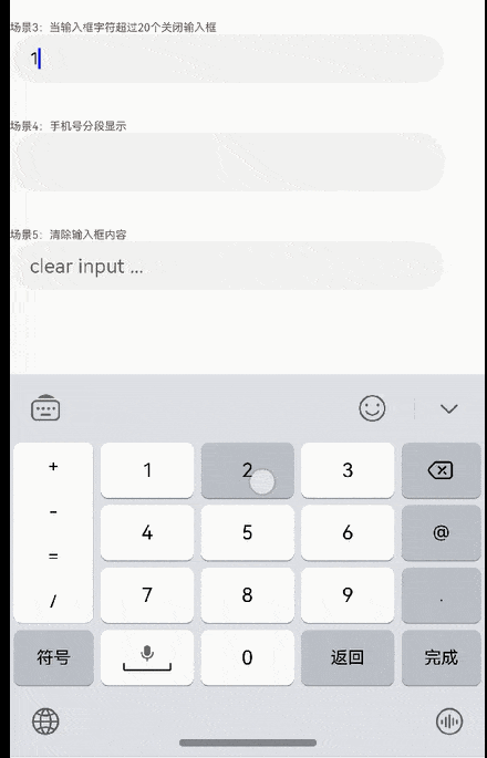
场景四:输入手机号码时分段展示
在输入手机号码时,自动按照规定的格式进行分段显示。
TextInput({ text: `${this.text}` }).type(InputType.PhoneNumber).height('48vp')
  .onChange((number: string) => {
    let teleNumberNoSpace: string = this.removeSpace(number);
    if (teleNumberNoSpace.length > this.NUM_TEXT_MAXSIZE_LENGTH - 2) {
      this.text = teleNumberNoSpace;
    } else if (this.checkNeedNumberSpace(number)) {
      if (teleNumberNoSpace.length <= 3) {
        this.text = teleNumberNoSpace;
      } else {
        let split1: string = teleNumberNoSpace.substring(0, 3);
        let split2: string = teleNumberNoSpace.substring(3);
        this.text = split1 + ' ' + split2;
        if (teleNumberNoSpace.length > 7) {
          split2 = teleNumberNoSpace.substring(3, 7);
          let split3: string = teleNumberNoSpace.substring(7);
          this.text = split1 + ' ' + split2 + ' ' + split3;
        }
      }
    } else {
      this.text = number;
    }
  })
场景五:输入框右侧添加清除内容按钮
当输入框中有内容时,在右侧显示清除按钮,点击后清空输入框内容。
TextInput({ text: this.textThree, placeholder: 'clear input ...', controller: this.controller })
  .height(40)
  .margin({ bottom: 20 })
  .cancelButton({
    style: CancelButtonStyle.INPUT,
    icon: {
      size: 22,
      src: $r('app.media.clear'),
      color: Color.Blue
    }
  })
  .onChange((value: string) => {
    this.textThree = value
  })
场景六:自定义密码图标的样式
实现点击眼睛图标动态切换图标样式以及设置密码的显隐状态。
Row({
  Image(this.imgRes).width(35).height(35).onClick(() => {
    this.changeState = !this.changeState;
    if (this.changeState) {
      this.imgRes = this.openEye;
    } else {
      this.imgRes = this.closeEys;
    }
  })
  TextInput({ text: this.textSix, controller: this.TextInputController })
    .type(this.changeType)
    .placeholderFont({ size: 16, weight: 400 })
    .showPasswordIcon(false)
    .height(40)
    .width(300)
    .borderRadius(20)
    .margin(2)
    .border({ width: 1 })
    .onChange((value: string) => {
      this.textSix = value;
    })
    .showPassword(this.changeState)
})
.alignItems(VerticalAlign.Center)
  .justifyContent(FlexAlign.Center)
  .height(50)
  .width(350)


