

本文是 Material Design 系列第四篇:TextInputLayout 主要是作为 EditText 的容器,从而为 EditText 生成一个浮动的 Label,当用户点击 EditText 的时候,EditText 中的 hint 字符串会自动移到 EditText 的左上角。
TextInputLayout 的简单使用,是 Google 推出的整个 Material Design 库的一个缩影:Google 将 UI 视觉效果设计得华丽且流畅,同时代码封装更为优雅,开发者只需要在 layout.xml 中写好布局文件,就可以轻松在手机屏幕上展现出魔法般的动画效果,实在是妙不可言。
一、TextInputLayout 相关 API
TextInputLayout 控件 API 官网列举了很多,这里只是整理出开发中常用属性,每个方法对应相关 XML 属性感兴趣的可以查查官网文档。
setCounterEnabled(boolean enabled)在此布局中是否启用了字符计数器功能。
setCounterMaxLength(int maxLength)设置要在字符计数器上显示的最大长度。
setBoxBackgroundColorResource(int boxBackgroundColorId)设置用于填充框的背景色的资源。
setBoxStrokeColor(int boxStrokeColor)设置轮廓框的笔触颜色。
setCounterOverflowTextAppearance(int counterOverflowTextAppearance)使用指定的 TextAppearance 资源设置溢出字符计数器的文本颜色和大小。
setCounterOverflowTextColor(ColorStateList counterOverflowTextColor)使用 ColorStateList 设置溢出字符计数器的文本颜色。(此文本颜色优先于 counterOverflowTextAppearance 中设置的文本颜色)
setCounterTextAppearance(int counterTextAppearance)使用指定的 TextAppearance 资源设置字符计数器的文本颜色和大小。
setCounterTextColor(ColorStateList counterTextColor)使用 ColorStateList 设置字符计数器的文本颜色。(此文本颜色优先于 counterTextAppearance 中设置的文本颜色)
setErrorEnabled(boolean enabled)在此布局中是否启用了错误功能。
setErrorTextAppearance(int errorTextAppearance)设置来自指定 TextAppearance 资源的错误消息的文本颜色和大小。
setErrorTextColor(ColorStateList errorTextColor)设置错误消息在所有状态下使用的文本颜色。
setHelperText(CharSequence helperText)设置将在下方显示的帮助消息 EditText。
setHelperTextColor(ColorStateList helperTextColor)设置辅助状态在所有状态下使用的文本颜色。
setHelperTextEnabled(boolean enabled)在此布局中是否启用了辅助文本功能。
setHelperTextTextAppearance(int helperTextTextAppearance)设置指定 TextAppearance 资源中的辅助文本的文本颜色和大小。
setHint(CharSequence hint)设置要在浮动标签中显示的提示(如果启用)。
setHintAnimationEnabled(boolean enabled)是否获取焦点的时候,hint 文本上移到左上角开启动画。
setHintEnabled(boolean enabled)设置是否在此布局中启用浮动标签功能。
setHintTextAppearance(int resId)从指定的 TextAppearance 资源设置折叠的提示文本的颜色,大小,样式。
setHintTextColor(ColorStateList hintTextColor)从指定的 ColorStateList 资源设置折叠的提示文本颜色。
setPasswordVisibilityToggleEnabled(boolean enabled)启用或禁用密码可见性切换功能。
二、TextInputLayout 使用详解
1、基本使用
- 布局文件中只需要在 EditText 外层包裹一层 TextInputLayout 布局即可
<com.google.android.material.textfield.TextInputLayout
    android:id="@+id/userInputLayout"
    android:layout_width="match_parent"
    android:layout_height="wrap_content"
    android:hint="Username">

    <EditText
        android:layout_width="match_parent"
        android:layout_height="wrap_content"
        android:textSize="14dp" />

</com.google.android.material.textfield.TextInputLayout>
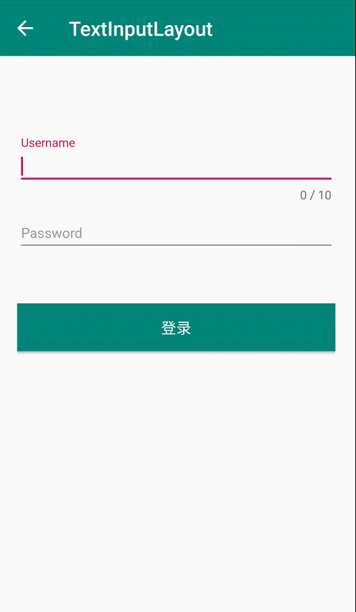
2、开启错误提示
设置文本框输入最大长度,并且开启错误提示,当文本框输入文本长度超出时,报错显示。
// 开启错误提示
userInputLayout.setErrorEnabled(true);
// 开启计数
userInputLayout.setCounterEnabled(true);
// 设置输入最大长度
userInputLayout.setCounterMaxLength(10);
3、自定义浮动标签字体样式
默认浮动标签样式跟 APP 主题色 colorAccent 色值一致,所以需要自定义样式,修改标签字体大小和颜色
- 自定义 style
<style name="hintAppearence" parent="TextAppearance.AppCompat">
    <item name="android:textSize">14dp</item>
    <item name="android:textColor">@color/colorPrimary</item>
</style>
- 使用 setHintTextAppearance()方法加载自定义样式
userInputLayout.setHintTextAppearance(R.style.hintAppearence);
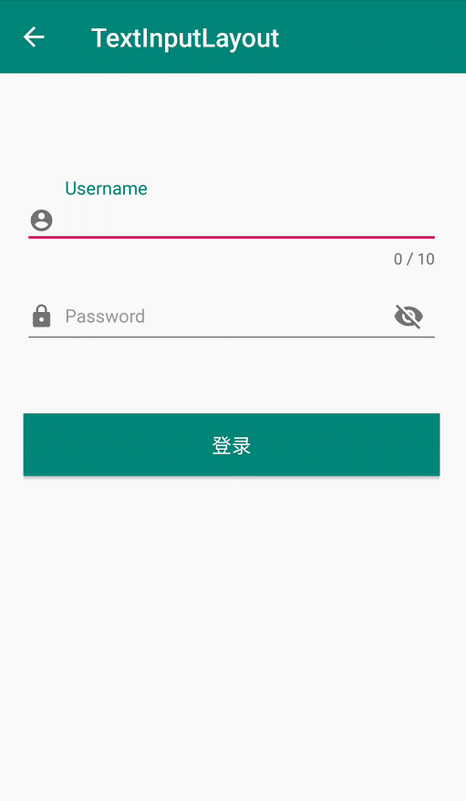
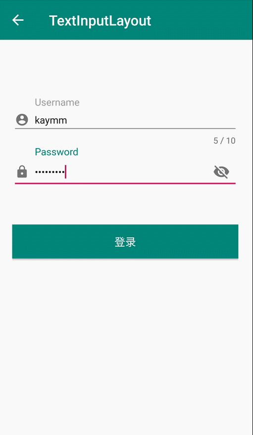
如图所示,Username 文本框是自定义样式效果,Password 文本框是系统默认效果
TextInputLayout 中所有关于样式的设置方式都采用这种方式,所以这里只举例一种,其他属性直接照搬即可使用 。
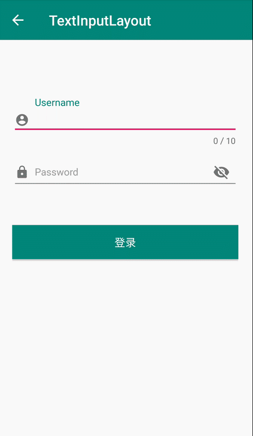
4、密码可见性切换
APP 登录界面密码框经常会遇到最右边有一个“小眼睛”图标,点击可以切换密码是否可见,以前我们实现时,使用一个 ImageView,然后根据点击事件判断标记位更新文本框的内容。现在使用 TextInputLayout 只需要一行代码即可轻松实现。
这里使用 XML 属性实现,对应的 setPasswordVisibilityToggleEnabled(boolean enabled) 方法
<com.google.android.material.textfield.TextInputLayout
    android:layout_width="match_parent"
    android:layout_height="wrap_content"
    android:focusable="false"
    android:focusableInTouchMode="false"
    android:hint="Password"
    app:counterOverflowTextAppearance="@style/hintAppearence"
    app:hintTextAppearance="@style/hintAppearence"
    app:passwordToggleEnabled="true">

    <EditText
        android:layout_width="match_parent"
        android:layout_height="wrap_content"
        android:drawableStart="@drawable/ic_baseline_lock_24"
        android:drawablePadding="8dp"
        android:inputType="textPassword"
        android:textSize="14dp" />

</com.google.android.material.textfield.TextInputLayout>
以上文本框左边的 icon 使用 EditText 的android:drawableStart属性添加
5、文本框输入校验
一般情况下,APP 用户名称输入都会有校验功能,本文以用户名长度不大于 10 为例,如果超出时,输入框底部报错提示。
采用EditText.addTextChangedListener()方法实现,相信大家对这个监听方法并不陌生,因为没有 TextInputLayout 之前,这个应该是最常用的方式了。
注意:TextInputLayout.getEditText()方法获取的就是内部的 EditText 控件,所以不需要在 Activity 中在 findViewById 初始化 View
userInputLayout.getEditText().addTextChangedListener(new TextWatcher() {
    @Override
    public void beforeTextChanged(CharSequence s, int start, int count, int after) {
        // 文本变化前调用
    }

    @Override
    public void onTextChanged(CharSequence s, int start, int before, int count) {
        // 文本发生变化时调用
    }

    @Override
    public void afterTextChanged(Editable s) {
        // 文本发生变化后调用
        if(userInputLayout.getEditText().getText().toString().trim().length()>10){
            userInputLayout.setError("用户名长度超出限制");
        }else{
            userInputLayout.setError(null);
        }
    }
});
以上五种使用方式应该是开发过程中最常见的功能了,官网关于 TextInputLayout 属性太多了,好多属性我自己到现在都没理解干什么的。不过只要掌握开发中这些常用的属性就足够了,TextInputLayout 底层实现了 LinearLayout,感兴趣的朋友可以查看阅读源码深入学习。
源码下载:https://github.com/jaynm888/MaterialDesign-master.git
源码包含 Material Design 系列控件集合,定时更新,敬请期待!
三、总结
本片文章已经是 Material Design 系列第四篇了,我会坚持把 Material Design 系列控件全部介绍完毕,最后会将所有的 Demo 整合一套源码分享给大家,敬请期待!相信看完我的博客对你学习 Material Design UI 控件有一定的帮助,因为我会把每个控件开发中的基本使用详细讲解,简单易懂。
我的微信:Jaynm888
欢迎点评,
诚邀 Android 程序员加入微信交流群,公众号回复加群或者加我微信邀请入群。


