
1、废话不多说,先看效果
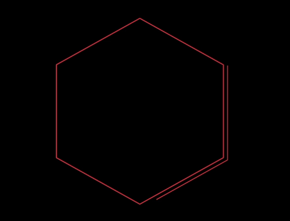
2、实现原理
使用了 stroke-dasharray 和 stroke-dashoffset 控制线条动画。
需要了解学习SVG,可以看看SVG线条动画入门
3、实现代码
HTML
<svg version="1.1" xmlns="http://www.w3.org/2000/svg" xmlns:xlink="http://www.w3.org/1999/xlink" width="300px" height="300px">
    <polygon class="g-polygon-wrap" points="150 0, 300 75, 300 225, 150 300, 0 225,  0 75, 150 0" />
    <polygon class="g-polygon-move" points="150 0, 300 75, 300 225, 150 300, 0 225,  0 75, 150 0" />
</svg>
CSS
html,
body {
    width: 100%;
    height: 100%;
    display: flex;
    background: #000;
}

svg {
    margin: auto;
    overflow: visible;
    transform: scalex(.9);
}

.g-polygon-wrap,
.g-polygon-move {
    fill: none;
    stroke: #bf303c;
    stroke-width: 2;
    stroke-linejoin: round;
    stroke-linecap: round;
}

.g-polygon-move {
    transform-origin: center center;
    transform: scale(1.05);
    stroke: linear-gradinet(180deg, red, transprent);
    stroke-width:1.5;
    stroke-dasharray: 280, 700;
    stroke-dashoffset: 8;
    animation: move 2.4s infinite linear;
}

@keyframes move {
    0% {
        stroke-dashoffset: 8;
    }
    100% {
        stroke-dashoffset: -972;
    }
}
4、实现简单,代码粘贴复制即可预览效果,最后,贴一下自己的小程序,喜欢可以扫码查看


