
http://blog.minidx.com/2009/11/05/3021.html
下面是main.mxml:
- <?xml version="1.0" encoding="utf-8"?>
- <s:Application name="Halo_Alert_borderSkin_test"
- xmlns:fx="http://ns.adobe.com/mxml/2009"
- xmlns:s="library://ns.adobe.com/flex/spark"
- xmlns:mx="library://ns.adobe.com/flex/halo">
- <fx:Style>
- @namespace s "library://ns.adobe.com/flex/spark";
- @namespace mx "library://ns.adobe.com/flex/halo";
- mx|Alert {
- borderSkin: ClassReference("skins.CustomPanelBorderSkin");
- }
- </fx:Style>
- <fx:Script>
- <![CDATA[
- import mx.controls.Alert;
- protected function btn_clickHandler(evt:MouseEvent):void {
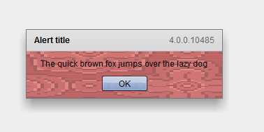
- var a:Alert = Alert.show("The quick brown fox jumps over the lazy dog", "Alert title");
- a.status = mx_internal::VERSION;
- }
- ]]>
- </fx:Script>
- <mx:ApplicationControlBar width="100%" cornerRadius="0">
- <s:Button id="btn"
- label="Launch Alert"
- click="btn_clickHandler(event);" />
- </mx:ApplicationControlBar>
- </s:Application>
下面为skins/CustomPanelBorderSkin.mxml的代码:
- <?xml version="1.0" encoding="utf-8"?>
- <s:SparkSkin name="CustomPanelBorderSkin"
- xmlns:fx="http://ns.adobe.com/mxml/2009"
- xmlns:s="library://ns.adobe.com/flex/spark"
- implements="mx.core.IRectangularBorder">
- <fx:Script>
- <![CDATA[
- import mx.core.EdgeMetrics;
- import mx.core.IUIComponent;
- /* Define the skin elements that should not be colorized.
- For panel, border and title backround are skinned, but the content area and title text are not. */
- static private const exclusions:Array = ["background"];
- override public function get colorizeExclusions():Array {
- return exclusions;
- }
- /* Define the content fill items that should be colored by the "contentBackgroundColor" style. */
- static private const contentFill:Array = [];
- override public function get contentItems():Array {
- return contentFill
- };
- private var _metrics:EdgeMetrics = new EdgeMetrics(1, 32, 1, 1);
- public function get borderMetrics():EdgeMetrics {
- var hasPanelParent:Boolean = isPanel(parent);
- var controlBar:IUIComponent = hasPanelParent ? Object(parent).mx_internal::_controlBar : null;
- if (controlBar && controlBar.includeInLayout) {
- _metrics.bottom = controlBar.getExplicitOrMeasuredHeight() + 1;
- } else {
- _metrics.bottom = 1;
- }
- return _metrics;
- }
- public function get backgroundImageBounds():Rectangle {
- return null;
- }
- public function set backgroundImageBounds(value:Rectangle):void {
- }
- public function get hasBackgroundImage():Boolean {
- return false;
- }
- public function layoutBackgroundImage():void {
- }
- override protected function updateDisplayList(unscaledWidth:Number, unscaledHeight:Number):void {
- var em:EdgeMetrics = borderMetrics;
- if (em.bottom > 1) {
- cbbg.height = em.bottom - 1;
- cbdiv.bottom = cbbg.height;
- cbbg.visible = cbdiv.visible = true;
- } else {
- cbbg.visible = cbdiv.visible = false;
- }
- super.updateDisplayList(unscaledWidth, unscaledHeight);
- }
- private static var panels:Object = {};
- private static function isPanel(parent:Object):Boolean {
- var s:String = getQualifiedClassName(parent);
- if (panels[s] == 1) {
- return true;
- }
- if (panels[s] == 0) {
- return false;
- }
- if (s == "mx.containers::Panel") {
- panels[s] == 1;
- return true;
- }
- var x:XML = describeType(parent);
- var xmllist:XMLList = x.extendsClass.(@type == "mx.containers::Panel");
- if (xmllist.length() == 0) {
- panels[s] = 0;
- return false;
- }
- panels[s] = 1;
- return true;
- }
- ]]>
- </fx:Script>
- <!-- drop shadow -->
- <s:Rect left="0" top="0" right="0" bottom="0">
- <s:filters>
- <s:DropShadowFilter blurX="20" blurY="20" alpha="0.32" distance="11" angle="90" knockout="true" />
- </s:filters>
- <s:fill>
- <s:SolidColor color="0" />
- </s:fill>
- </s:Rect>
- <!-- layer 1: border -->
- <s:Rect left="0" right="0" top="0" bottom="0">
- <s:stroke>
- <s:SolidColorStroke color="0" alpha="0.50" weight="1" />
- </s:stroke>
- </s:Rect>
- <!-- layer 2: background fill -->
- <s:Rect id="background" left="1" top="1" right="1" bottom="1" alpha="0.6">
- <s:fill>
- <s:BitmapFill source="@Embed('assets/pattern_158.gif')" />
- </s:fill>
- </s:Rect>
- <!-- layer 3: title bar fill -->
- <s:Rect left="1" right="1" top="1" height="30">
- <s:fill>
- <s:LinearGradient rotation="90">
- <s:GradientEntry color="0xE2E2E2" />
- <s:GradientEntry color="0xD9D9D9" />
- </s:LinearGradient>
- </s:fill>
- </s:Rect>
- <!-- layer 4: title bar highlight -->
- <s:Rect left="1" right="1" top="1" height="30">
- <s:stroke>
- <s:LinearGradientStroke rotation="90" weight="1">
- <s:GradientEntry color="0xEAEAEA" />
- <s:GradientEntry color="0xD9D9D9" />
- </s:LinearGradientStroke>
- </s:stroke>
- </s:Rect>
- <s:Rect left="1" right="1" top="31" height="1">
- <s:fill>
- <s:SolidColor color="0xC0C0C0" />
- </s:fill>
- </s:Rect>
- <!-- layer 5: control bar background -->
- <s:Rect id="cbbg" left="1" right="1" bottom="1" height="20">
- <s:fill>
- <s:SolidColor color="0xE8E8E8" />
- </s:fill>
- </s:Rect>
- <!-- layer 6: control bar divider line -->
- <s:Rect id="cbdiv" left="1" right="1" bottom="20" height="1">
- <s:fill>
- <s:SolidColor color="0xCDCDCD" />
- </s:fill>
- </s:Rect>
- </s:SparkSkin>
效果如下:


